Private portfolio · UI/UX Design (App & SaaS)

Screens people get at a glance

13 product designs across SaaS dashboards, mobile apps and booking websites. For each one: who it is for, what is on the screen, and the design decisions behind it.

How I design

Four rules behind every screen

The same thinking runs through all 13 products, whatever the industry.

  • 01

    One accent, used for action

    Each product gets a single strong colour. It marks the buttons, the active menu item and the key numbers, so the eye always knows where to go next.

  • 02

    The answer comes first

    Dashboards open with three or four headline numbers, each with its trend, before any detail. The question a user opens the app with is answered in the first second.

  • 03

    Patterns people already know

    Sidebars, cards, task boards, tab bars and date strips. Familiar patterns mean nobody needs a tutorial, and the product’s own personality goes into colour, type and imagery instead.

  • 04

    Built for every screen

    Half of these products are shown on more than one device. The phone version is not a shrunk desktop: it keeps only what someone needs on the move.

Project 01

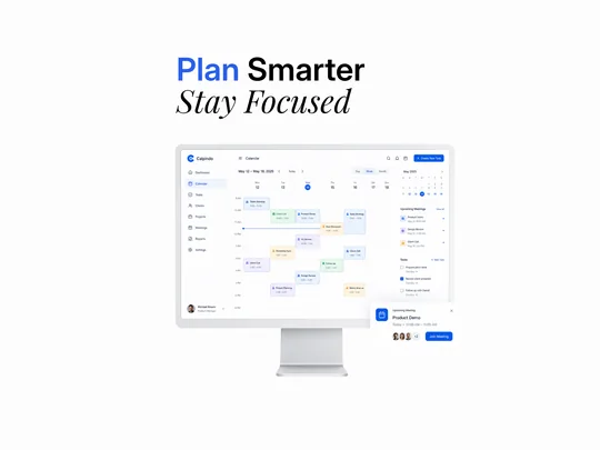
Calpindo: a calendar that plans the week

  • SaaS dashboard
  • Scheduling
  • Web app
  • Light theme

A scheduling workspace for client-facing teams. The week view, upcoming meetings and to-dos sit on one screen, so a manager can plan the day without jumping between apps.

Calpindo · Week planner · Meetings · Tasks
Web appPlatform
LightTheme
8Sidebar sections
DesktopShown on

Who it’s for

People who live in meetings, like account and product managers, juggle a calendar, a task list and a client list in separate tools. Calpindo puts the three side by side and brings the next meeting forward as a pop-up with a one-click Join button.

  • Day, week and month views
  • Colour-coded meetings
  • Live “now” line
  • Upcoming meetings
  • Task checklist
  • Join-meeting pop-up
  • Mini month calendar

Design decisions

  1. Each meeting type gets its own soft colour (calls green, demos blue, reviews violet, deals amber), so the week reads at a glance.
  2. A blue “now” line runs across the calendar, so you always know where you are in the day.
  3. Strong blue is saved for actions only: Create New Task, Join Meeting and today’s date.

Colour palette

  • Action blue#0457EA
  • Canvas#FDFDFE
  • Soft tint#ECF4F8

Almost all white, one strong blue for actions, and pale tints for each meeting type.

Project 02

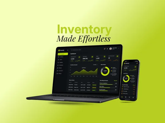
Stockify: inventory made effortless

  • SaaS dashboard
  • Inventory
  • Web + mobile
  • Dark theme

An inventory dashboard for online sellers and small warehouses, designed for laptop and phone. Stock value, orders and low-stock items come first, with alerts for anything about to run out.

Stockify · Stock levels · Orders · Low-stock alerts
Web + mobilePlatform
DarkTheme
8Sidebar sections
Laptop + phoneShown on

Who it’s for

Running out of a best-seller loses sales, and overstocking ties up cash. Stockify shows the health of all the stock in one ring chart (in stock, low, out) and lists exactly which products to reorder, on the laptop and in your pocket.

  • KPI cards with trends
  • Inventory over time
  • Stock status ring
  • Recent orders
  • Top-selling products
  • Low-stock alerts
  • Mobile companion app

Design decisions

  1. A dark interface with a single lime accent makes numbers and alerts pop, and stays easy on the eyes for people who keep it open all day.
  2. Order status uses colour-coded tags (completed, processing, shipped), so nobody has to read every row.
  3. The phone version keeps only what you need on the move: total stock, stock status and the reorder list.

Colour palette

  • Lime#BCD22F
  • Night#101317
  • Card#14181C

Near-black surfaces with one electric lime for charts, highlights and the active menu item.

Project 03

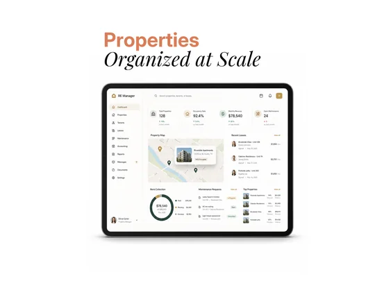
RE Manager: properties organized at scale

  • SaaS dashboard
  • Property management
  • Web app
  • Light theme

A property management dashboard for landlords and managers with many buildings. Occupancy, monthly rent, leases and repair requests live on one screen, next to a map of every property.

RE Manager · Occupancy · Rent · Leases · Repairs
Web appPlatform
LightTheme
10Sidebar sections
TabletShown on

Who it’s for

Managing many buildings means chasing rent, renewing leases and fixing things, usually across spreadsheets and email. RE Manager brings it into one view: rent paid, pending and overdue, new leases, open repair tickets and the best-performing buildings.

  • Portfolio KPIs
  • Property map with previews
  • Recent leases
  • Rent collection ring
  • Repair tickets with status
  • Top properties
  • Messages and documents

Design decisions

  1. A warm ivory base with gold and forest green feels closer to real estate than the usual tech blue.
  2. The map turns a list of addresses into something you can see, with a preview card showing each building’s occupancy.
  3. Repair requests carry status tags (open, in progress, completed), so the manager sees what needs chasing.

Colour palette

  • Gold#AF7F36
  • Forest#274137
  • Ivory#FDFCFB

Ivory surfaces, forest green for charts and a muted gold for actions.

Project 04

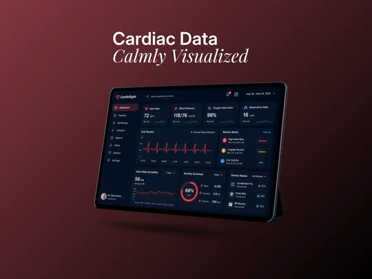
CardioSight: cardiac data calmly visualized

  • SaaS dashboard
  • Healthcare
  • Web app
  • Dark theme

A heart-monitoring dashboard for cardiologists. A patient’s vital signs, ECG rhythm, alerts and connected devices are shown calmly, so urgent things stand out without causing alarm.

CardioSight · Vital signs · ECG · Alerts · Devices
Web appPlatform
DarkTheme
8Sidebar sections
TabletShown on

Who it’s for

Doctors reviewing remote heart data need to spot what matters fast, like an irregular rhythm or a spike in heart rate. CardioSight puts four vital signs at the top with a plain status under each, then the ECG, then alerts ranked by how serious they are.

  • Heart rate, blood pressure, oxygen, breathing
  • ECG rhythm chart
  • Ranked alerts
  • Heart-rate variability
  • Activity summary
  • Device battery and status

Design decisions

  1. A deep navy background keeps the screen calm, and red is used only for heart data and urgent alerts.
  2. Every vital sign has a plain-language status (“Normal”) under the number, so it reads without interpretation.
  3. Alerts are ranked by colour and label (high, review, info), so the doctor knows what to look at first.

Colour palette

  • Pulse red#DE3F45
  • Deep navy#091629
  • Normal green#25816C

Deep navy, a pulse red for heart data, and green for readings in the normal range.

Project 05

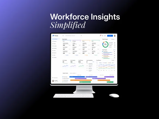
Flowza: workforce insights simplified

  • SaaS dashboard
  • Project management
  • Web app
  • Light theme

A project management dashboard for teams running several projects at once. A task board, overall progress, team efficiency and a timeline sit on one page, so a manager can see where everything stands.

Flowza · Task board · Progress · Timeline
Web appPlatform
LightTheme
9Sidebar sections
DesktopShown on

Who it’s for

Managers usually piece progress together from a task tool, a spreadsheet and status meetings. Flowza shows it in one place: tasks by stage, how far along each project is, upcoming deadlines and a timeline of what happens when.

  • Task board by stage
  • Overall progress ring
  • Active project bars
  • Team efficiency chart
  • Upcoming deadlines
  • Project timeline
  • Quick search (⌘K)

Design decisions

  1. Each project keeps the same colour on the progress bars and the timeline, so you can follow it around the page.
  2. Stages run left to right (To do, In progress, Review, Done), the way people already think about work.
  3. Search and a New Task button sit in the top bar, keeping the two most-used actions one click away.

Colour palette

  • Blue#2366ED
  • Violet#906DE5
  • Orange#FD8F2B
  • Green#3F9E87

A white workspace where colour does the organising: one colour per project or team.

Project 06

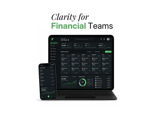
Finance CRM: clarity for financial teams

  • SaaS dashboard
  • Sales CRM
  • Web + mobile
  • Dark theme

A sales CRM for finance and advisory firms. The deal pipeline, revenue trend and top clients come first, on a tablet-sized web app and a matching phone app.

Finance CRM · Deal pipeline · Revenue · Top clients
Web + mobilePlatform
DarkTheme
7Sidebar sections
Tablet + phoneShown on

Who it’s for

Sales teams in finance need to know what is in the pipeline and what it is worth. This CRM shows every deal by stage with the total value of each stage, plus where deals come from and which clients matter most.

  • Revenue and deal KPIs
  • Pipeline board
  • Value per stage
  • Revenue trend
  • Deals by source
  • Top clients
  • Mobile pipeline view

Design decisions

  1. The pipeline reads left to right from Lead In to Won, and each stage shows its deal count and total value.
  2. Green, the colour of money and growth, is the only accent: revenue, trends and the New Deal button.
  3. On the phone the board becomes a stacked list of stages, easy to scroll with one thumb.

Colour palette

  • Growth green#5DD16F
  • Graphite#191F23
  • Night#0F1317

Graphite surfaces with one bright green for revenue, trends and actions.

Project 07

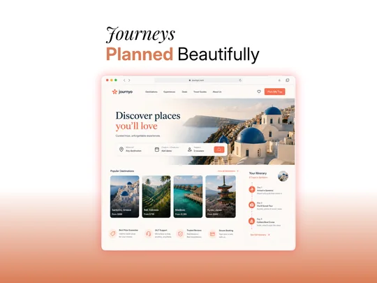
Journyo: journeys planned beautifully

  • Website
  • Travel booking
  • Website
  • Light theme

A travel booking site that sells the feeling first. A full-width destination photo and a serif headline set the mood, and the where, when and who search sits right under it.

Journyo · Trip search · Destinations · Itinerary
WebsitePlatform
LightTheme
5Menu links
DesktopShown on

Who it’s for

Travel sites often bury the inspiration under forms and filters. Journyo leads with the place, shows popular destinations with “from” prices, and previews a day-by-day itinerary so visitors can picture the trip before they book.

  • Where, when, who search
  • Popular destinations
  • Prices on every card
  • Day-by-day itinerary
  • Trust points
  • Plan My Trip button
  • Wishlist

Design decisions

  1. An elegant serif headline over a sunlit photo gives the site a premium, editorial feel.
  2. Coral is used only for actions and highlights: Plan My Trip, the search button and the itinerary steps.
  3. Four trust points (best price, 24/7 support, real reviews, secure booking) answer the usual booking worries early.

Colour palette

  • Coral#F56F51
  • Deep teal#0D292F
  • Sand#FCF9F6

Warm sand backgrounds, deep teal type and a coral accent that echoes the sunset.

Project 08

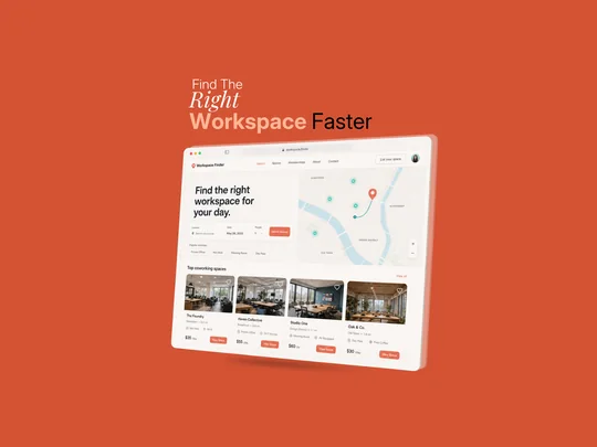
Workspace Finder: the right workspace, faster

  • Website
  • Coworking
  • Website
  • Light theme

A booking site for coworking spaces. Search by area, date and team size, see the options on a map, and compare spaces by price and amenities.

Workspace Finder · Search · Map · Coworking spaces
WebsitePlatform
LightTheme
5Menu links
DesktopShown on

Who it’s for

Remote workers and small teams often need a desk or a meeting room for a day, not a long lease. Workspace Finder puts the search and a live map side by side, with popular searches like Hot Desk and Day Pass as one-click shortcuts.

  • Location, date, people search
  • Popular search shortcuts
  • Interactive map
  • Price per day or hour
  • Amenity tags
  • List your space

Design decisions

  1. Search on the left, map on the right: people choosing a workspace think about where first.
  2. Each card shows the price and two key amenities, enough to shortlist without clicking.
  3. A separate List your space button speaks to the other side of the marketplace, the space owners.

Colour palette

  • Terracotta#D45334
  • Paper#FAF6F3
  • Map teal#92DACD

Soft paper tones with a terracotta accent, and teal pins on the map.

Project 09

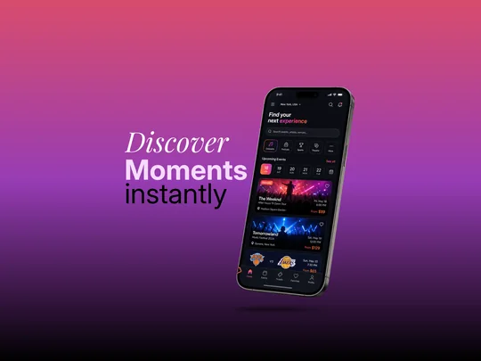
Event app: discover moments instantly

  • Mobile app
  • Events & tickets
  • iOS app
  • Dark theme

A mobile app for finding and booking live events nearby: concerts, festivals, sports and theatre. Big photo cards and a date strip make browsing feel like flipping through posters.

Event discovery app · Concerts · Festivals · Sports · Tickets
iOS appPlatform
DarkTheme
5Tab bar sections
PhoneShown on

Who it’s for

Finding something to do this weekend usually means checking several ticket sites. This app brings events into one feed by city, category and date, with the price up front on every card.

  • City picker
  • Search events, artists, venues
  • Category shortcuts
  • Date strip
  • Featured events
  • Price on every card
  • Favourites and tickets

Design decisions

  1. A dark interface lets the concert photos glow, like the lights at a real show.
  2. A pink-to-coral gradient marks the selected category and date, and gives the app its energy.
  3. Every card answers the three questions people ask (what, when, how much) without opening it.

Colour palette

  • Hot pink#CB2E53
  • Night#0B0D14
  • Blush#F299A8

A near-black base with a hot pink-to-coral gradient for everything selected.

Project 10

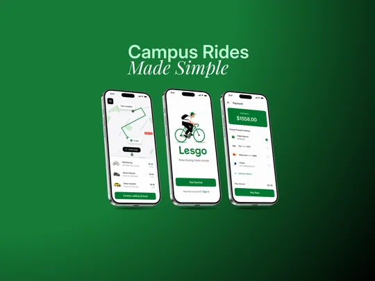
Lesgo: campus rides made simple

  • Mobile app
  • Ride sharing
  • iOS app
  • Light theme

A ride-sharing app for students getting around campus by bike, e-bike or car. The design covers the three key moments: getting started, choosing a ride on the map, and paying.

Lesgo · Map · Ride options · Payment
iOS appPlatform
LightTheme
3Screens shown
PhoneShown on

Who it’s for

Students want cheap, quick trips across campus. Lesgo shows nearby options on a map with price and arrival time side by side, so choosing a ride takes one tap, and paying uses the in-app wallet or a saved card.

  • Welcome screen
  • Live map with route
  • Ride options
  • Price and arrival time
  • Confirm and book
  • Wallet balance
  • Saved cards and PayPal

Design decisions

  1. A friendly illustration and the line “Ride sharing made simple” set a relaxed, student tone from the first screen.
  2. Ride options are compared on the two things that matter, price and minutes away, in one list.
  3. One green is used for every main action (Get Started, Confirm and book, Pay Now), so the next step is always clear.

Colour palette

  • Campus green#157B37
  • White#FDFDFD
  • Soft green#7DBB8C

Clean white screens with one fresh green for the brand, the route and every main button.

Project 11

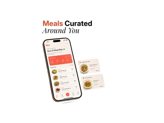
Bite: meals curated around you

  • Mobile app
  • AI meal planning
  • iOS app
  • Light theme

An AI meal-planning app that builds a day of meals around your goals. Today’s calories and macros sit at the top, and every meal shows its calories and diet tags.

Bite · AI meal plan · Nutrition · Diet plans
iOS appPlatform
LightTheme
4Tab bar sections
PhoneShown on

Who it’s for

Eating to a goal, like more protein or fewer carbs, takes planning most people don’t have time for. Bite does the planning: it suggests every meal from breakfast to snack, adds up the nutrition and offers ready plans such as High Protein or Low Carb.

  • Daily nutrition summary
  • Today’s meal plan
  • Calories per meal
  • Diet tags
  • Ready-made plans
  • Quick add button
  • Progress tab

Design decisions

  1. Real food photos on warm cream make it feel like a menu, not a calorie spreadsheet.
  2. Small tags under each meal (high protein, low carb, balanced) explain why it was picked.
  3. A floating + button in the tab bar makes adding a meal a single tap.

Colour palette

  • Tomato#F65E49
  • Cream#F8EFE8
  • White#FFFFFF

Warm cream and white with a tomato-red accent that makes you hungry.

Project 12

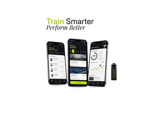
Athlevo: train smarter, perform better

  • Mobile app
  • Sports coaching
  • iOS app
  • Dark + light

A sports coaching app for athletes: find a coach, book training sessions and track weekly progress. The brand carries through to merchandise too, like the water bottle in the mockup.

Athlevo · Find a coach · Book sessions · Progress
iOS appPlatform
Dark + lightTheme
3Screens shown
PhoneShown on

Who it’s for

Athletes looking for a coach compare ratings, specialities and prices in many places. Athlevo lists coaches with all three, books sessions into a weekly schedule, and shows progress so training feels like it is going somewhere.

  • Coach search by sport
  • Ratings and price per session
  • Weekly schedule
  • Booking confirmations
  • Weekly goal ring
  • Performance chart
  • Next session card

Design decisions

  1. Black headers over white content cards give it a sporty, high-contrast look.
  2. Lime marks the selected day, the main button and progress, so the eye goes straight to the next session.
  3. The Book a Session button sits at the bottom of the screen, right under the thumb.

Colour palette

  • Volt lime#BFDF03
  • Black#15171B
  • Light grey#F2F2F4

Black and white with a volt-lime accent borrowed from sports gear.

Project 13

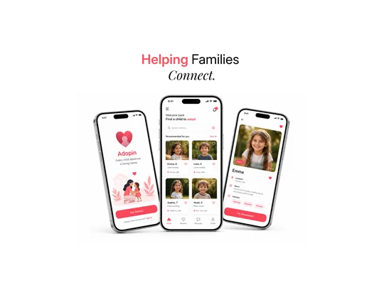
Adopin: helping families connect

  • Mobile app
  • Adoption
  • iOS app
  • Light theme

An adoption app that helps families get to know children waiting for a home. Warm, gentle screens put each child’s personality first: their name, age and what they love.

Adopin · Welcome · Browse · Child profile
iOS appPlatform
LightTheme
3Screens shown
PhoneShown on

Who it’s for

Adoption is emotional, and the process can feel cold and bureaucratic. Adopin makes the first step gentle: a warm welcome, child profiles built around interests rather than paperwork, and a simple “I’m interested” button to start the conversation.

  • Welcome screen
  • Recommended for you
  • Search and filters
  • Child profile
  • Interests
  • Save to favourites
  • I’m interested button

Design decisions

  1. A soft heart illustration and the line “Every child deserves a loving home” set a caring tone.
  2. Profiles lead with a photo and interests (drawing, reading, animals), so each child comes across as a person, not a case file.
  3. One warm heart-red is used for hearts and actions, and everything else stays white and calm.

Colour palette

  • Heart red#FB4759
  • White#FEFEFE
  • Blush#FEA5AA

White, airy screens with one warm heart-red for love and action.

Next

Have a product that needs a clearer interface?

Tell me about your app or SaaS, who uses it and what they need to get done, and I’ll come back with ideas for the screens that matter most.

Private work

Full portfolio

Case studies and client results are password protected. Enter the password to view them.

Don’t have the password? Request access

What do you need?
Monthly budget
No spam. By sending, you agree to the privacy policy.