
Private portfolio · Ad Creatives

Ads that make people stop scrolling

Concept campaigns and key visuals, shown with everything behind them: the idea, the art direction, the type and colour choices, and a storyboard for the motion version.

Project 01

Vaseline: every crack has a cure

  • Concept campaign
  • Skin care
  • Concept design
  • Art direction
  • Social & print

A campaign about repairing dry skin, deep moisture and skin protection. Miniature storytelling turns cracked, dry skin into a small world where tiny workers stand for care, repair and restoration.

Concept work: a self-initiated campaign idea, not commissioned by Vaseline.

Project overview

Dry skin repair, deep moisture and skin protection, told through miniature scenes. Every crack becomes a job site, and the jelly is what the crew uses to fix it.

Typography

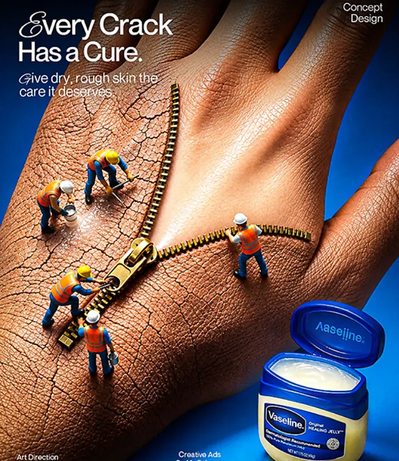
Every Crack
Has a Cure.Script initial + modern sans

Elegant script initials paired with a modern sans-serif. The script adds warmth, the sans keeps headlines strong and easy to read.

Colour palette

  • Vaseline blue#0449D1
  • Deep blue#033375
  • White#FFFFFF
  • Warm skin#B0663F
  • Deep skin#5D2D12

Blue, white and natural skin tones: trust, purity, freshness and healthy-looking skin, while staying true to Vaseline’s brand identity.

Visual strategy

  1. Macro photography
  2. Miniature characters
  3. Realistic textures
  4. Dramatic lighting
  5. Creative product placement

Every frame is built to tell a small story and land one product benefit.

Storyboard

“Every Crack Has a Cure”

Spot
20-second social video
Format
4:5 feed, 9:16 stories
Frames
6
Music
Soft piano that builds to a warm swell
Version
Storyboard v1
  1. 01Hook0:00–0:03
    Tilt up
    Shot
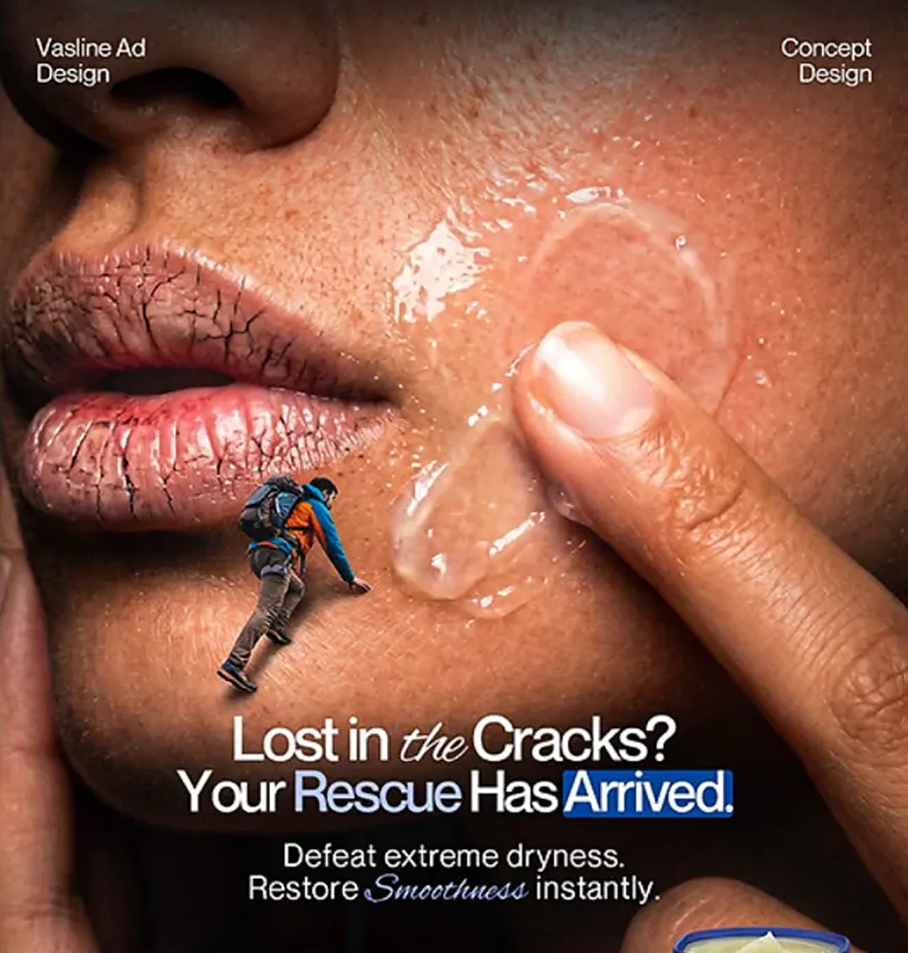
    Extreme close-up macro, slow tilt up the cheek.
    Action
    A tiny hiker climbs across a dry, cracked cheek. A fingertip enters frame with a drop of jelly.
    Super
    Lost in the Cracks?
    Audio
    Wind over rock, boots on dry skin. VO: “Lost in the cracks?”
    Whip pan along the crack line
  2. 02The idea0:03–0:06
    Push in
    Shot
    Top-down macro, slow push in.
    Action
    A miniature crew pulls a giant zipper across the back of a hand. The crack closes behind it.
    Super
    Every Crack Has a Cure.
    Audio
    Zipper pull, first piano note. VO: “Every crack has a cure.”
    Match cut: zipper line to wrist crease
  3. 03Product at work0:06–0:10
    Track right
    Shot
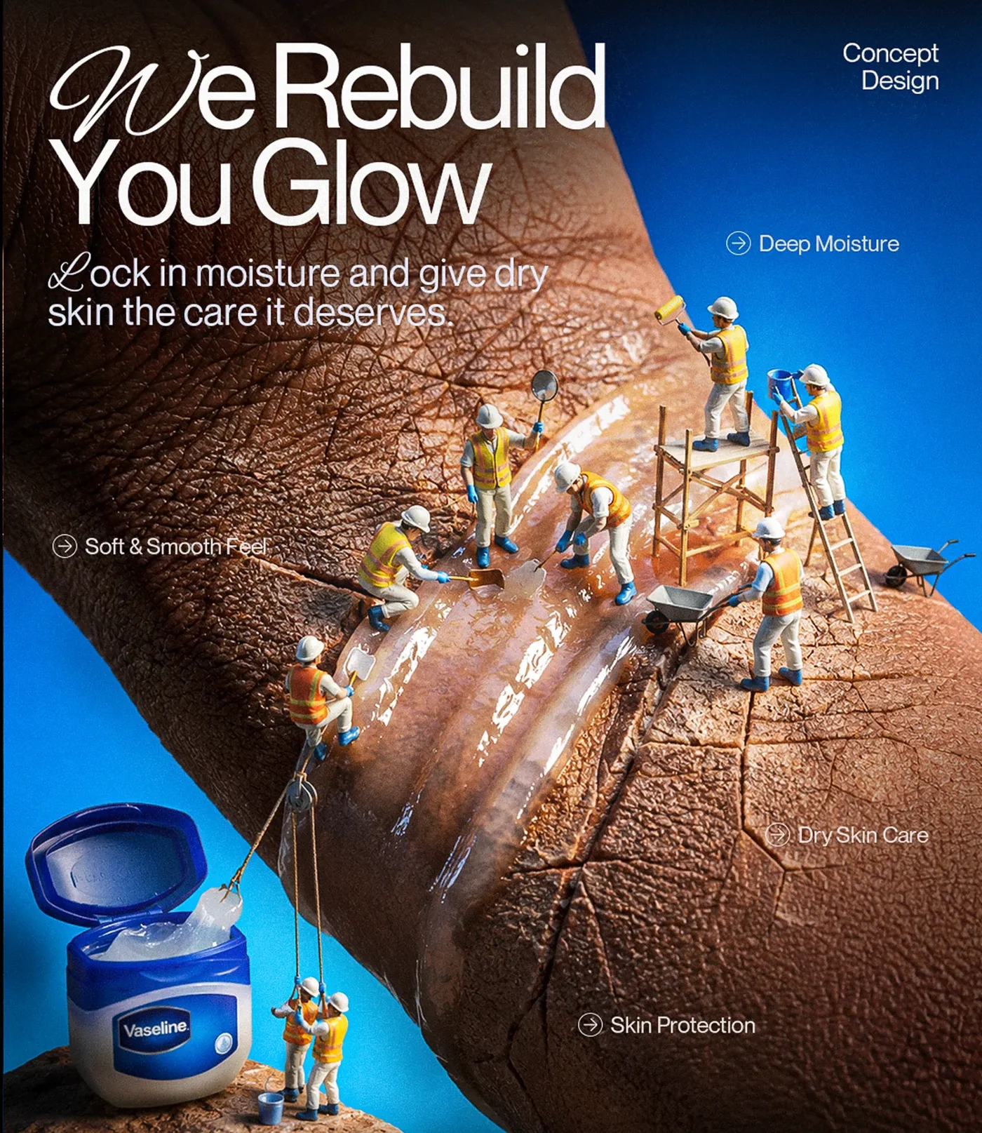
    High-angle macro, tracking left to right.
    Action
    Workers lower jelly from the open jar by pulley, then spread it with shovels and rollers from scaffolding. Dry skin turns glossy.
    Super
    We Rebuild You Glow · Deep Moisture · Skin Protection
    Audio
    Miniature construction foley: clinks, a wheelbarrow, a soft squelch. Music builds.
    Wipe on the passing wheelbarrow
  4. 04Second benefit0:10–0:13
    Rack focus
    Shot
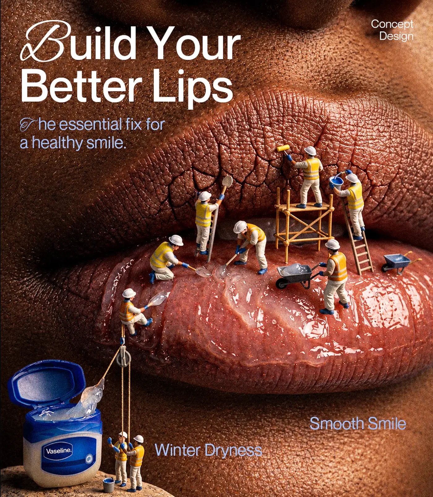
    Extreme close-up of lips, rack focus from the cracked upper lip to the glossy lower lip.
    Action
    The crew repairs cracked lips. The lower lip is already smooth.
    Super
    Build Your Better Lips · Winter Dryness → Smooth Smile
    Audio
    Paint roller, bucket splash. The beat lands on the focus pull.
    Straight cut
  5. 05Human touch0:13–0:16
    Dolly in
    Shot
    Medium close-up, soft key light, slow dolly in.
    Action
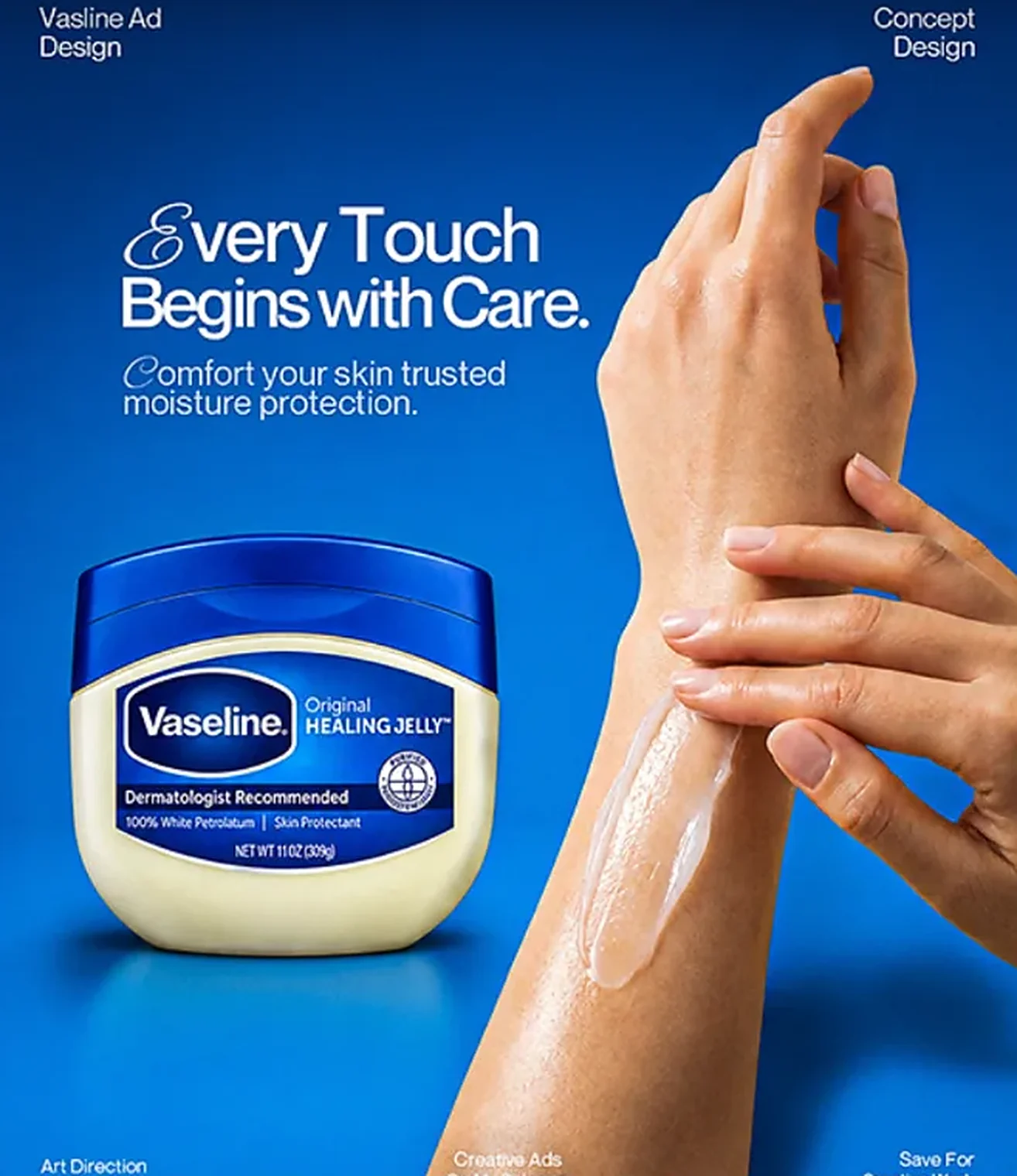
    Real hands smooth jelly along a wrist. The jar sits sharp in the foreground.
    Super
    Every Touch Begins with Care.
    Audio
    Music warms, a soft skin swipe. VO: “Comfort your skin with trusted moisture protection.”
    Light fade to blue
  6. 06End card0:16–0:20
    Locked off
    Shot
    Locked-off wide on the jar, a slow light sweep across the label.
    Action
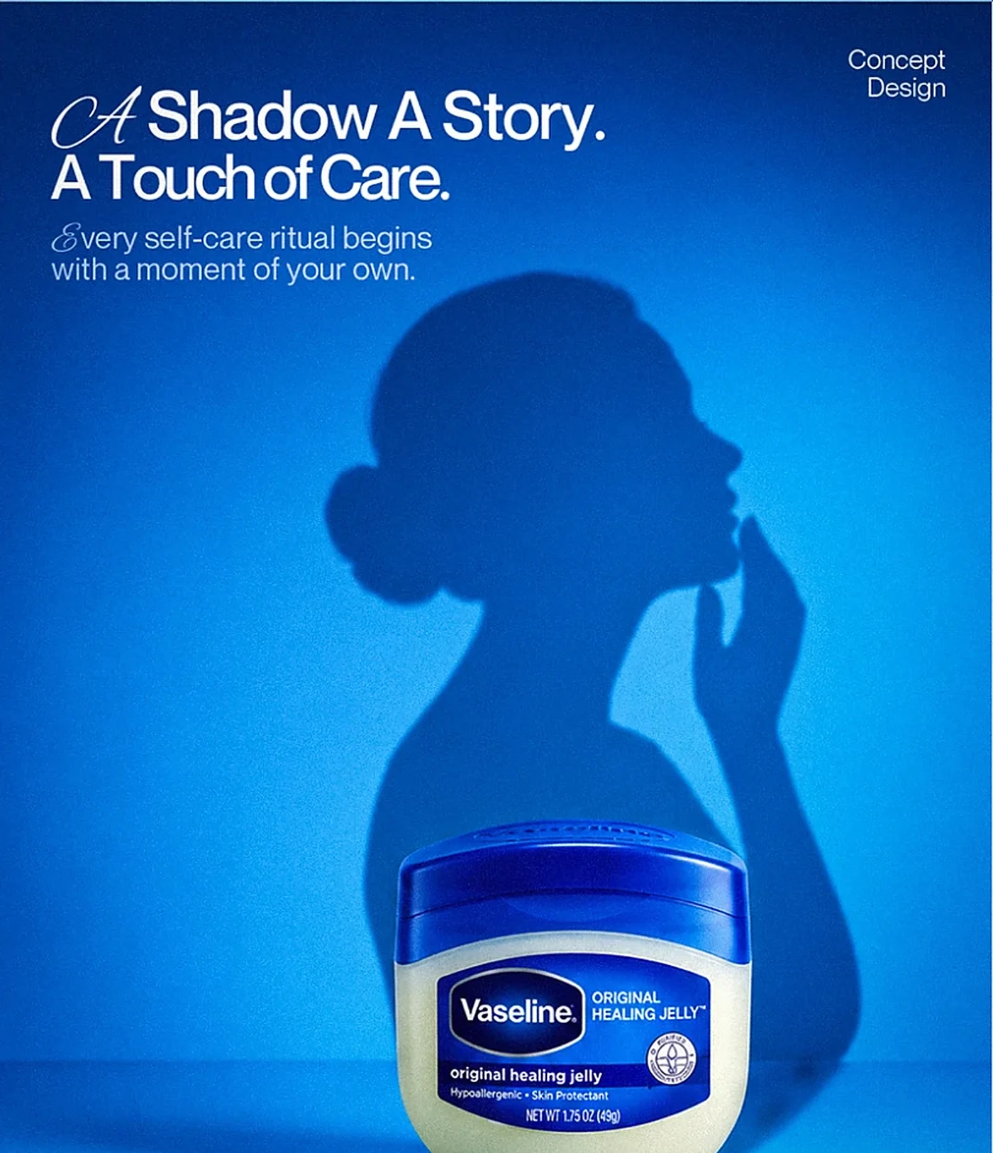
    A woman’s shadow touches her chin behind the Original Healing Jelly jar.
    Super
    A Shadow A Story. A Touch of Care. + Vaseline logo
    Audio
    Music resolves. VO: “Vaseline. A touch of care.”
    End
Project 02

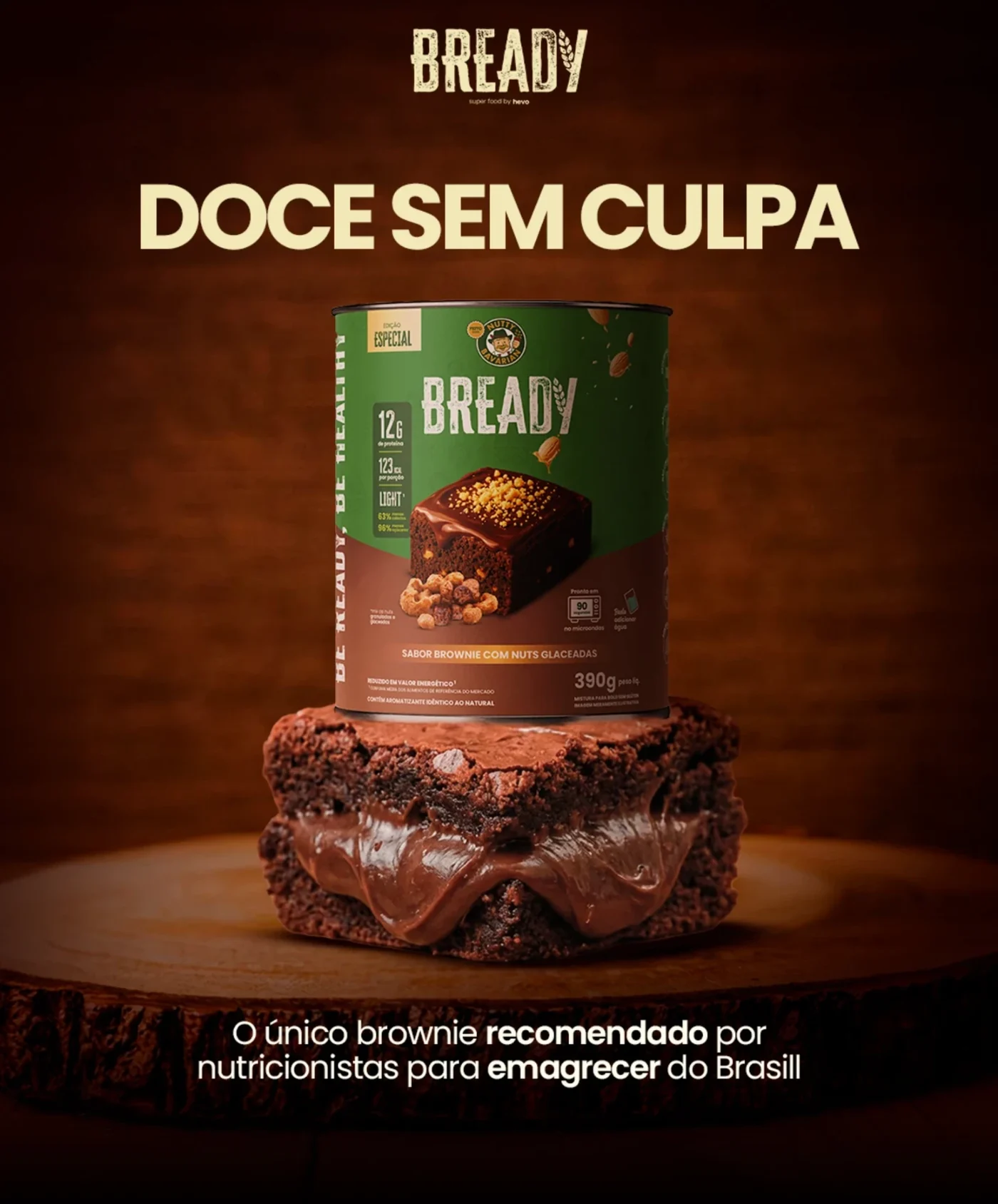
Bready: doce sem culpa

  • Social ad campaign
  • Food & nutrition
  • Product launch
  • Social ads
  • Brazil

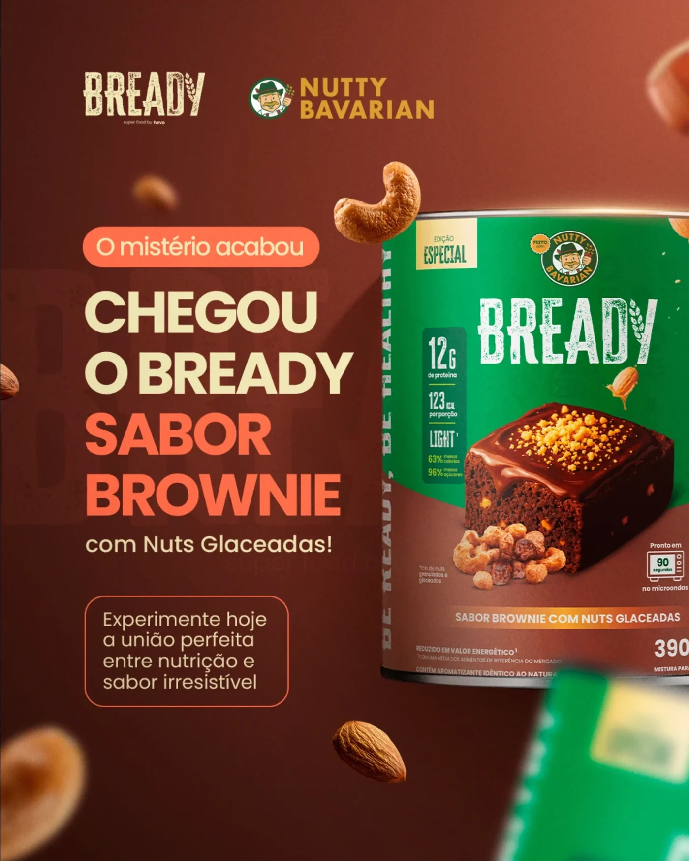
Launch creatives for Bready’s brownie flavour with glazed nuts, made with Nutty Bavarian, for Brazilian social feeds. The set covers the reveal, the product promise, the nutrition numbers, creator and customer proof, everyday moments and an offer for retailers.

Project overview

One product, many jobs. Each post in the set has a single task: announce the flavour, sell the promise of a guilt-free sweet, prove it with numbers, show real people enjoying it, and win retail partners.

Typography

12gde proteína
sem culpa.Bold geometric sans

Heavy geometric sans-serif headlines in capitals, quick to read on a phone, next to the brand’s distressed stamp logo. When a number is the selling point, it goes big.

Colour palette

  • Chocolate#491A13
  • Coral#F4744E
  • Cream#F0E6B5
  • Can green#037B39
  • Cocoa black#1C0300

Chocolate brown and cream taken from the product itself, coral for highlights and calls to action, and the can’s green so it’s recognised instantly in the feed and on the shelf.

Visual strategy

  1. Product hero photography
  2. Big-number nutrition callouts
  3. Creator content
  4. Real comments as social proof
  5. Everyday use moments
  6. Retail partner offer

Different formats for different stages: awareness, consideration, proof and trade.

Storyboard

“Chegou o Bready sabor brownie”

Spot
20-second launch video
Format
4:5 feed, 9:16 Reels and stories
Frames
6
Language
Brazilian Portuguese
Version
Storyboard v1
  1. 01Hook0:00–0:03
    Push in
    Shot
    Close-up on the can against a chocolate backdrop, slow push in.
    Action
    Cashews and almonds tumble past the green special-edition can as the label snaps into focus.
    Super
    O mistério acabou · Chegou o Bready sabor brownie (The mystery is over: Bready brownie is here)
    Audio
    A whoosh on each falling nut, a lid pop. VO: “O mistério acabou.”
    A nut passes the lens: wipe
  2. 02The promise0:03–0:06
    Crane up
    Shot
    Low-angle hero shot of the can on a filled brownie, slow crane up.
    Action
    Under a warm spotlight, chocolate filling oozes out of the brownie beneath the can.
    Super
    Doce sem culpa (Guilt-free sweet)
    Audio
    Low, warm bass hit and a soft ooze.
    Match cut on the brownie texture
  3. 03The numbers0:06–0:10
    Rack focus
    Shot
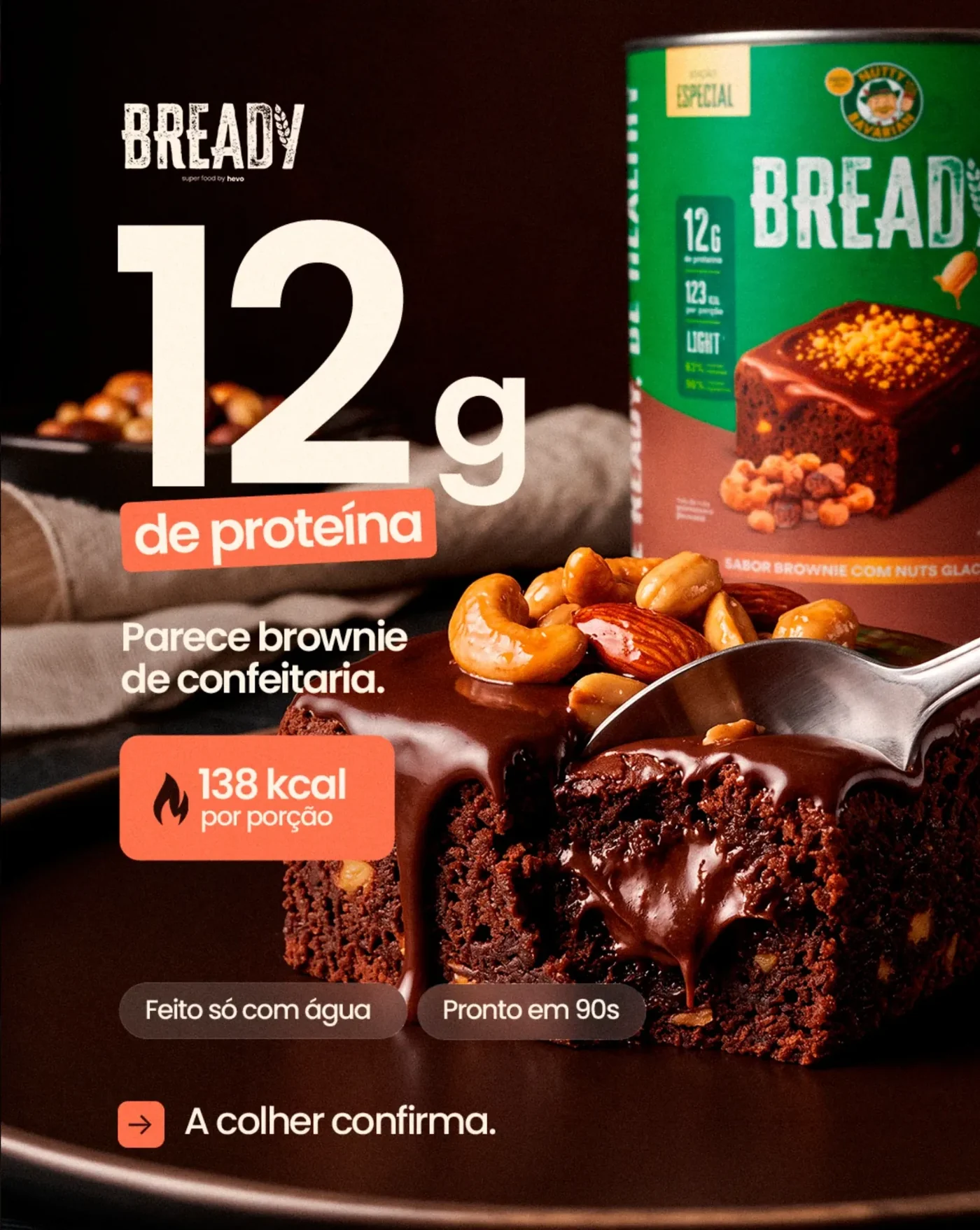
    Macro on the brownie, rack focus from the can to the spoon.
    Action
    A spoon breaks into the glazed brownie and chocolate pours over the cut.
    Super
    12g de proteína · 138 kcal por porção · Pronto em 90s (12 g protein, 138 kcal a serving, ready in 90 s)
    Audio
    Spoon crunch, each number lands on a beat. VO: “Parece brownie de confeitaria. A colher confirma.”
    Straight cut
  4. 04Real people0:10–0:13
    Handheld
    Shot
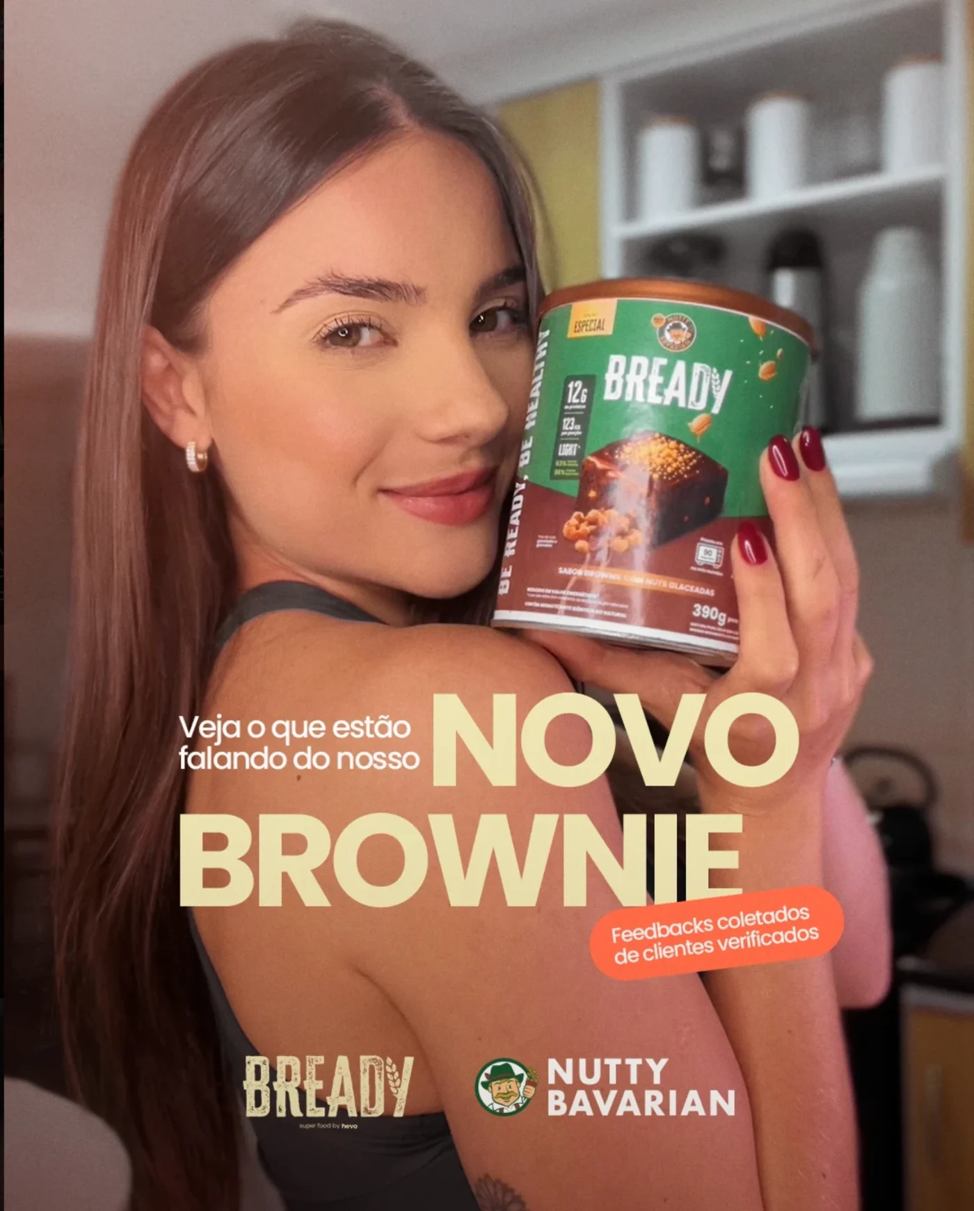
    Handheld, selfie-style shot of a creator in a home kitchen.
    Action
    The creator hugs the can to her cheek and smiles to camera.
    Super
    Veja o que estão falando do nosso novo brownie (See what people say about our new brownie)
    Audio
    Music drops to a light beat over natural room sound.
    Swipe up, like a story
  5. 05Social proof0:13–0:16
    Locked off
    Shot
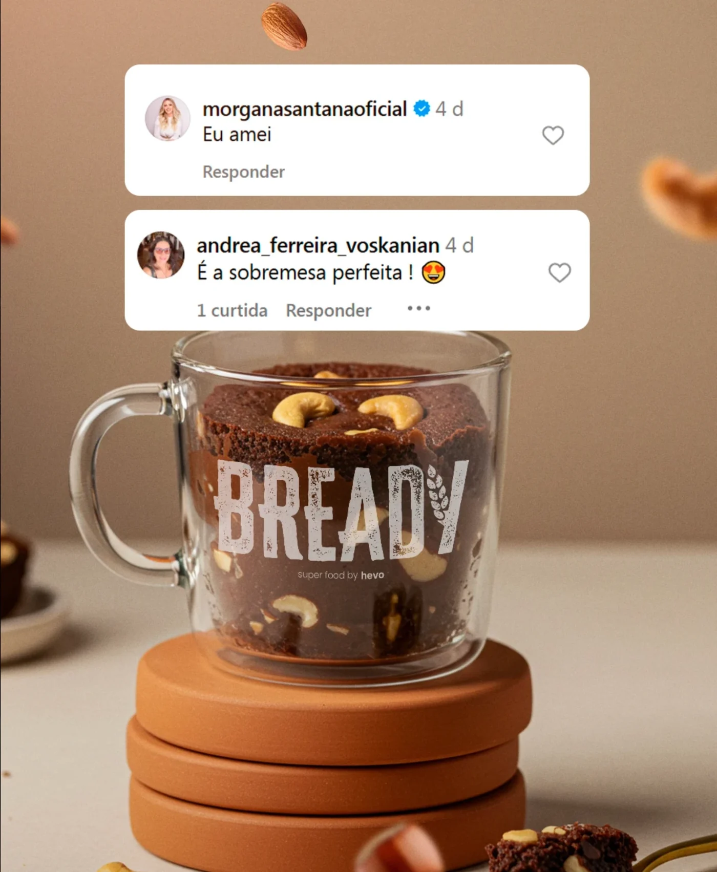
    Locked off on a brownie in a glass mug.
    Action
    Real Instagram comments pop in one at a time above the mug.
    Super
    “Eu amei” · “É a sobremesa perfeita!” (“I loved it” · “It’s the perfect dessert!”)
    Audio
    A notification ping as each comment lands.
    Cut on the second ping
  6. 06Moments + end card0:16–0:20
    Dolly in
    Shot
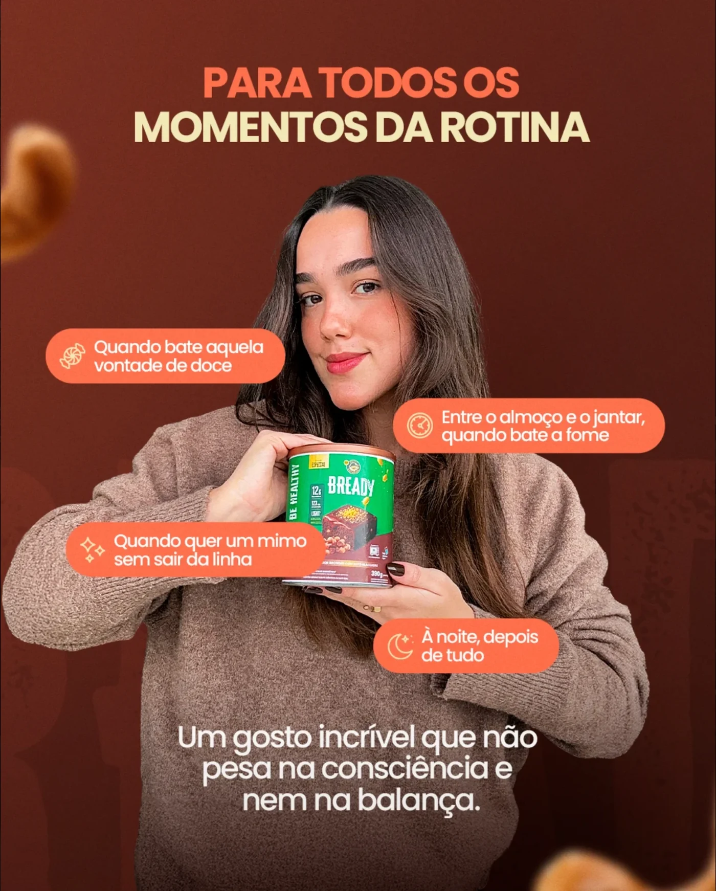
    Medium shot of a woman holding the can, slow dolly in.
    Action
    Four everyday-moment tags pop in around her, then cut to the Bready × Nutty Bavarian logo lockup.
    Super
    Para todos os momentos da rotina + logos (For every moment of your day)
    Audio
    Music resolves. VO: “Bready. Doce sem culpa.”
    End
Project 03

Enter Tech: get it now, pay simply

  • Campaign key visuals
  • Electronics & appliances
  • Instalments
  • Social & digital
  • Egypt

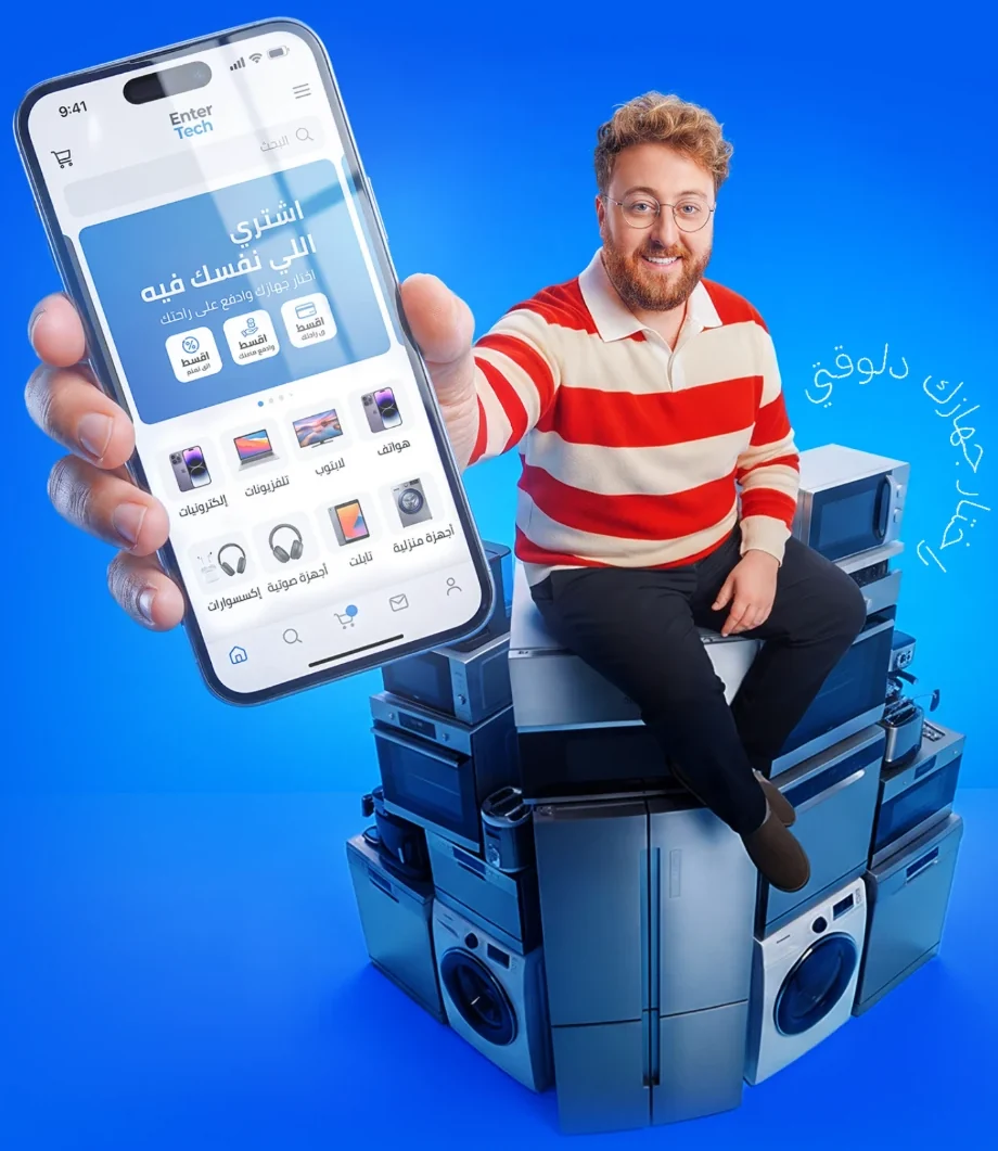
Key visuals for Enter Tech, an electronics and home appliance store with an app and instalment plans, written in Egyptian Arabic. One recurring character, one electric blue and a single message in different forms: get the device you want now and pay for it in simple instalments.

Project overview

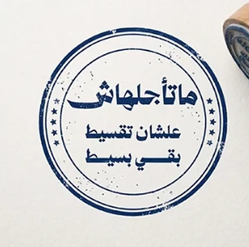
Instalments are a hard thing to make exciting, so the campaign turns them into characters and props: a man who gets what he wants today, a neon sign telling you not to wait, a receipt that never ends, and a stamp that says approved.

Typography

تجديد؟بيتك محتاج
Arabic display + script notes

Bold, custom-style Arabic display lettering for the headlines, a hand-drawn script for small side notes, and a clean Arabic sans-serif for supporting lines.

Colour palette

  • Electric blue#015EF0
  • Signal yellow#FFF301
  • Character red#DF1A18
  • White#FFFFFF
  • Night navy#102639

An electric blue that owns the whole campaign, signal yellow for the word that matters, the character’s red for warmth, and a night navy for the neon rooftop scenes.

Visual strategy

  1. A recurring brand character
  2. Real appliances as the set
  3. The app shown in hand
  4. Neon sign, receipt and stamp as instalment metaphors
  5. 3D sign design in three views
  6. Arabic display lettering

The same face and the same blue in every piece, so each post builds on the last.

Storyboard

ماتأجلهاش (Don’t put it off)

Spot
20-second instalment video
Format
9:16 Reels and stories, 16:9 YouTube
Frames
6
Language
Egyptian Arabic
Version
Storyboard v1
  1. 01Hook0:00–0:03
    Push in
    Shot
    Low-angle wide on a rooftop at night in the rain, slow push in.
    Action
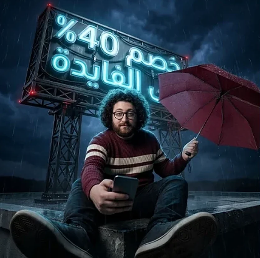
    Our character sits under a red umbrella scrolling his phone. A neon billboard behind him flickers on.
    Super
    خصم 40% على الفايدة (40% off the interest)
    Audio
    Rain, distant traffic, a neon buzz as the sign lights up.
    Whip pan up to the sign
  2. 02The message0:03–0:06
    Orbit
    Shot
    Close-up on the 3D neon sign, orbiting from front to three-quarter view.
    Action
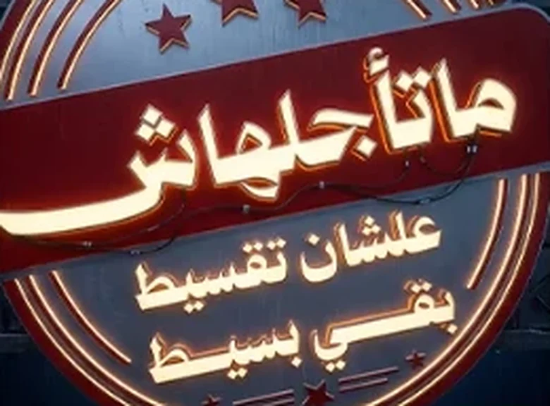
    The sign’s arrow blinks toward him as the letters light up one by one.
    Super
    ماتأجلهاش، علشان تقسيط بقى بسيط (Don’t put it off, instalments got simple)
    Audio
    Electric hum, one note per letter. VO: “ماتأجلهاش.”
    Match cut on the arrow
  3. 03The joke0:06–0:10
    Tilt down
    Shot
    Medium shot, tilt down following the paper to the floor.
    Action
    He reads a receipt that keeps unrolling, down the bench and across the rooftop: every device he wants.
    Super
    كل اللي نفسك فيه (Everything you’ve been wanting)
    Audio
    A receipt printer that won’t stop, a comic beat when it hits the floor.
    Hard cut to white
  4. 04Approval0:10–0:13
    Locked off
    Shot
    Top-down, locked off on paper.
    Action
    A rubber stamp slams down and lifts away, leaving the campaign seal.
    Super
    مبروك تمت الموافقة على طلبك (Congratulations, your request is approved)
    Audio
    A heavy stamp thud, then a bright chime.
    Flash to electric blue
  5. 05The new home0:13–0:16
    Crane down
    Shot
    High angle from his own phone, selfie style, crane down.
    Action
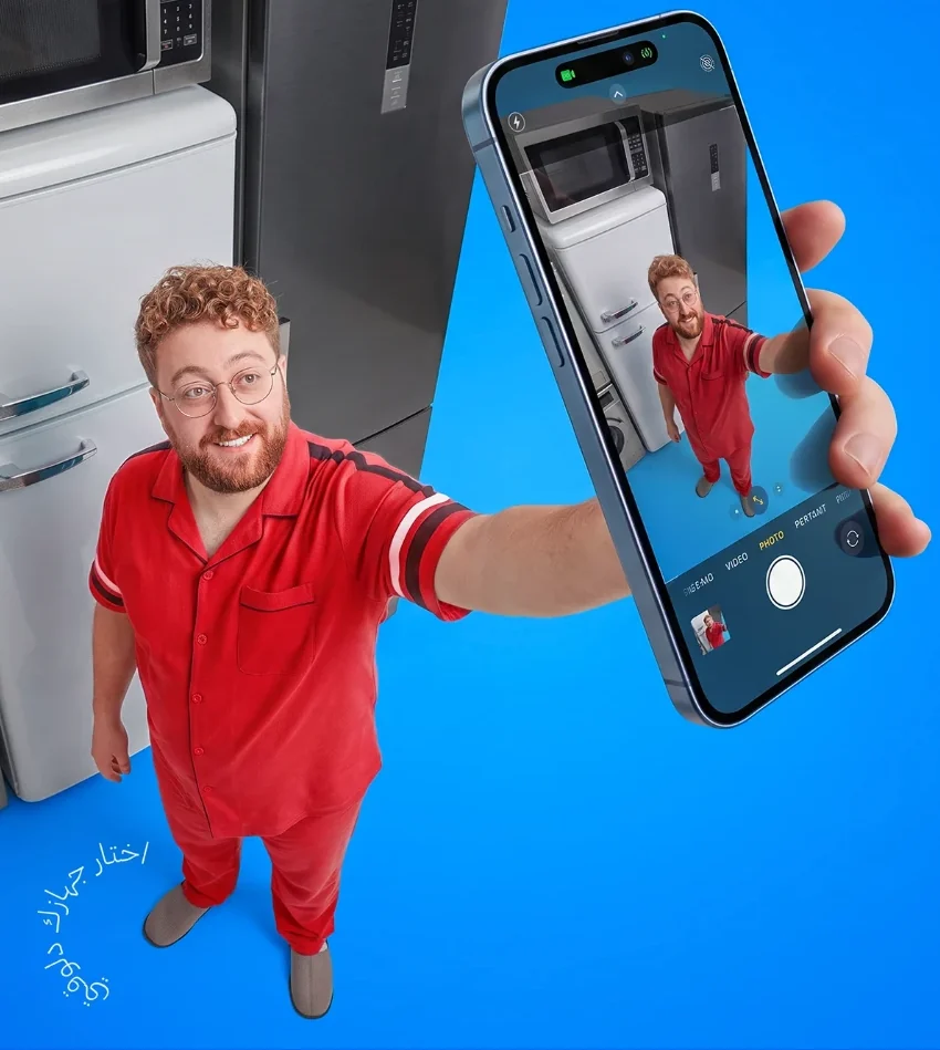
    In pyjamas, he takes a selfie in front of his new fridge, washer and microwave.
    Super
    بيتك محتاج تجديد؟ (Does your home need a refresh?)
    Audio
    Camera shutter, upbeat music kicks in.
    Phone screen wipe
  6. 06End card0:16–0:20
    Push in
    Shot
    Wide on him sitting on stacked appliances, push in to the phone in his hand.
    Action
    He holds the Enter Tech app out to camera; the screen fills the frame, then the logo.
    Super
    اختار جهازك دلوقتي + Enter Tech logo (Pick your device now)
    Audio
    Music resolves. VO: “اختار جهازك دلوقتي.”
    End
Project 04

Balance: balance your game

  • Social ad campaign
  • Food & nutrition
  • Sport & fitness
  • Social ads
  • Arabic & English

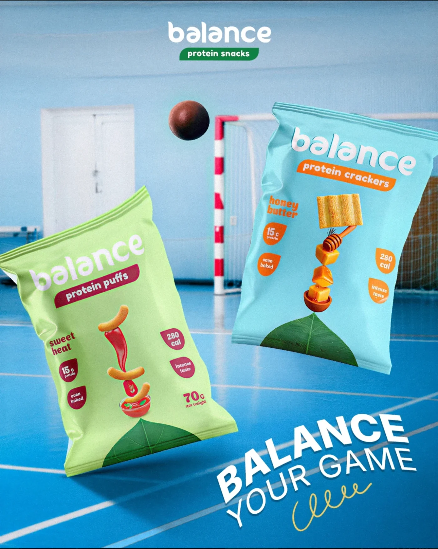
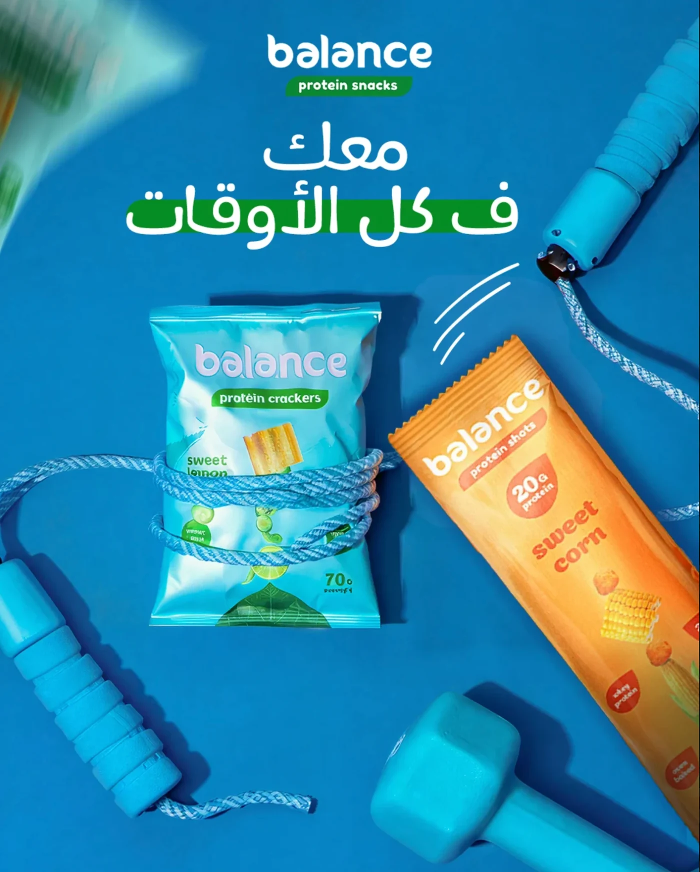
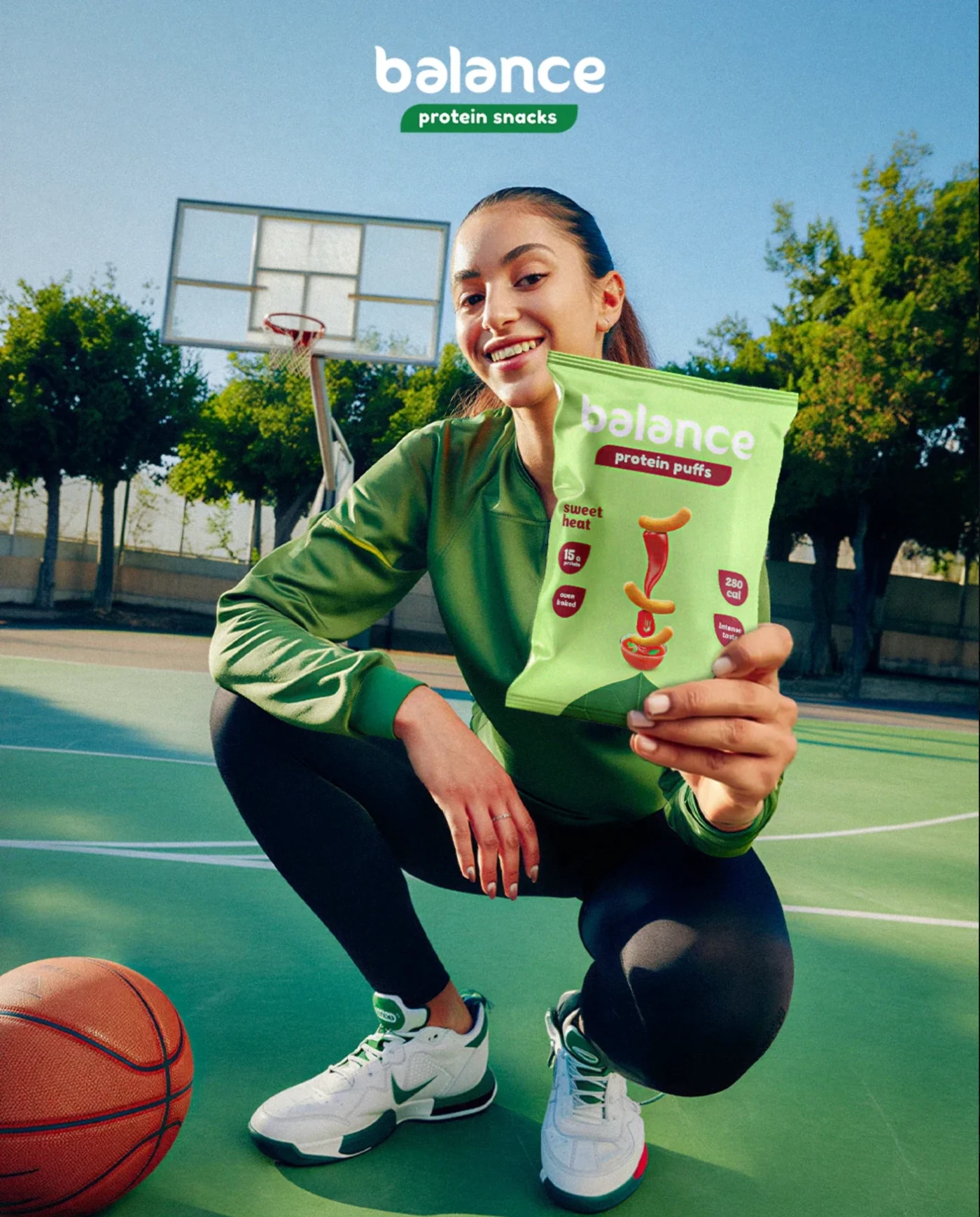
Social creatives for Balance, a range of protein crackers, puffs and shots, in Arabic and English. Every post puts the packs where active people already are: the court, the gym, the snack shelf and the training mat.

Project overview

A snack that wants to sit in the gym bag, not the cupboard. The set links protein to sport and play, uses one sky blue across every post, and lets each pack’s own colour do the flavour talking.

Typography

15gBalance
your game.Rounded sans + brush script + Arabic

A rounded, friendly logo wordmark, bold condensed sans and a quick brush script for English, and a soft, rounded Arabic display face so both languages feel like one brand.

Colour palette

  • Sky blue#64C4EF
  • Leaf green#118145
  • Lime#C0E98D
  • Aqua#8ED8DF
  • Berry#8C1E31

Sky blue as the stage for every post, leaf green from the logo, and the pack colours (lime, aqua and berry) to tell flavours apart at a glance.

Visual strategy

  1. Floating pack product shots
  2. Sports settings: court, gym, mat
  3. Phone UI as a hook
  4. Bilingual Arabic and English headlines
  5. Full flavour range line-ups
  6. Athlete and lifestyle photography

Product first in every frame, always shown in a moment of movement or training.

Storyboard

“Balance Your Game”

Spot
20-second social video
Format
4:5 feed, 9:16 Reels and stories
Frames
6
Language
Arabic and English
Version
Storyboard v1
  1. 01Hook0:00–0:03
    Push in
    Shot
    Close-up on the snack display, slow push in.
    Action
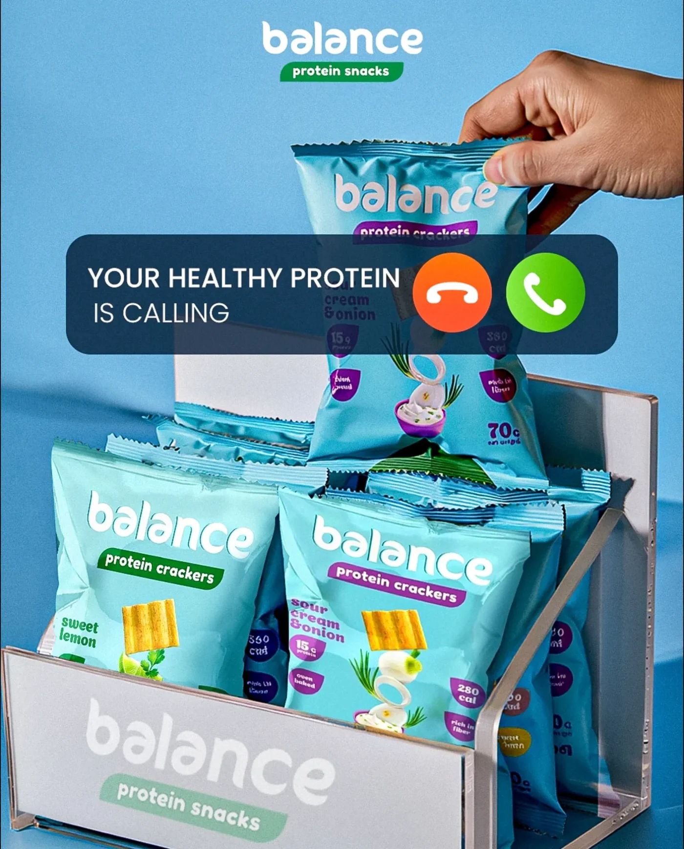
    An incoming-call banner slides down over the packs. A thumb hits accept and a hand pulls a pack from the display.
    Super
    Your Healthy Protein Is Calling
    Audio
    A phone ringtone that cuts out on the accept tap.
    Whip pan with the pack
  2. 02The equation0:03–0:06
    Tilt down
    Shot
    Medium close-up in a gym, tilt down from the dumbbell to the pack.
    Action
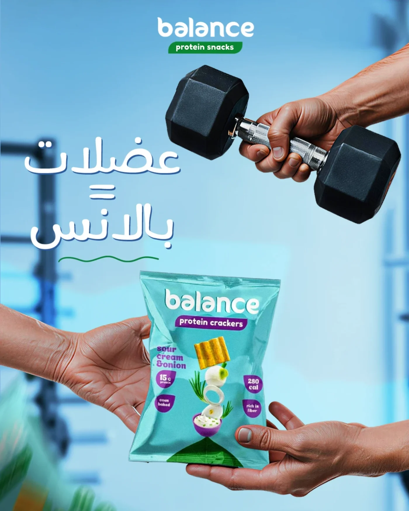
    One hand curls a dumbbell; below it, a pack is passed from one hand to another.
    Super
    عضلات = بالانس (Muscles = Balance)
    Audio
    Dumbbell clank, then the crinkle of the pack.
    Match cut on the moving pack
  3. 03Game on0:06–0:10
    Track right
    Shot
    Wide on an indoor court, tracking left to right.
    Action
    Two packs spin through the air in slow motion as a ball flies past the goal behind them.
    Super
    Balance Your Game
    Audio
    Squeaking trainers, a ball strike, the beat drops.
    Ball passes the lens: wipe
  4. 04The range0:10–0:13
    Locked off
    Shot
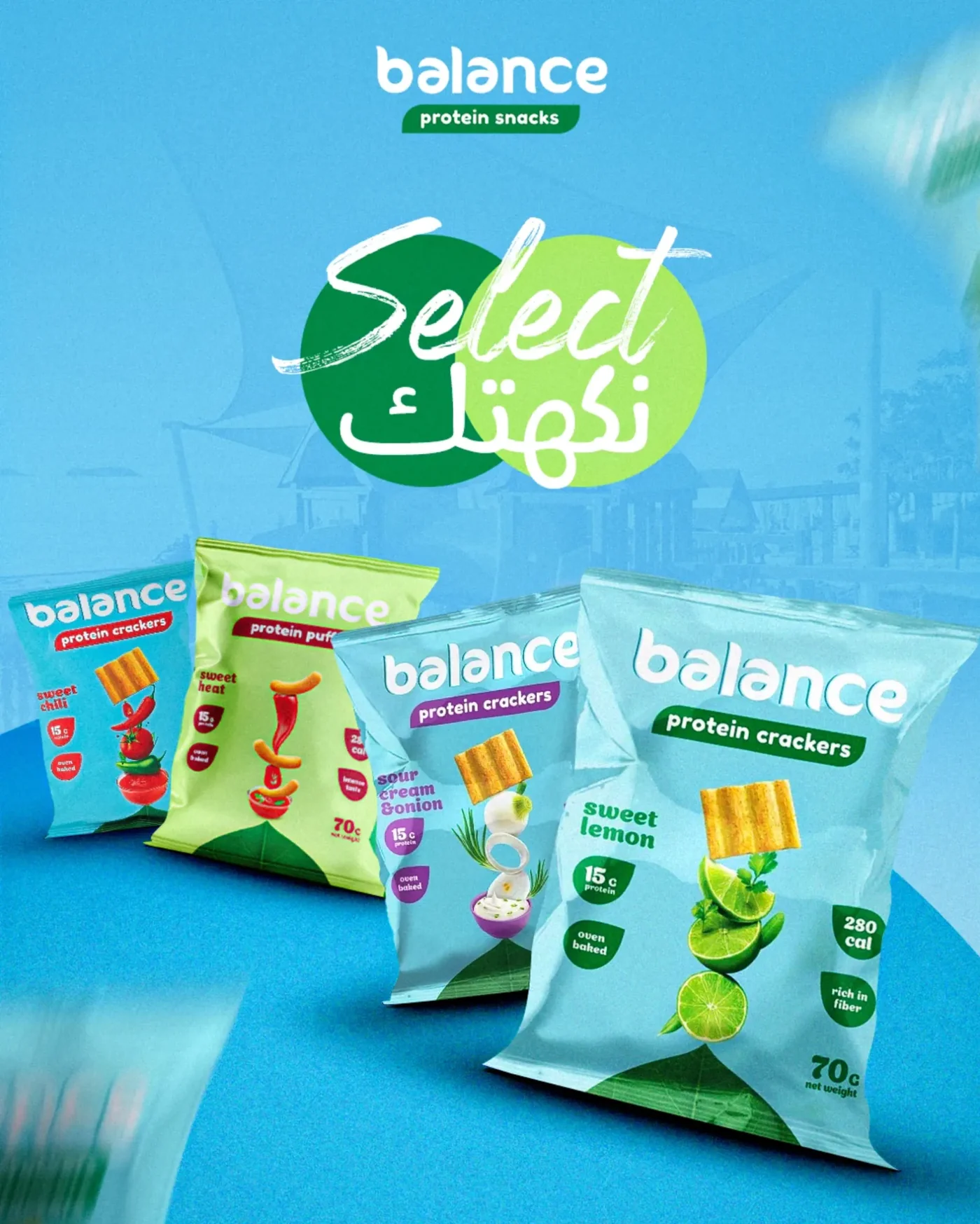
    Locked off on the line-up.
    Action
    Four packs drop into a row one at a time, each landing on a beat.
    Super
    Select نكهتك (Select your flavour) · 15g protein · oven baked
    Audio
    Four pops, one per pack.
    Straight cut
  5. 05Every moment0:13–0:16
    Top-down push in
    Shot
    Top-down flat lay, slow push in.
    Action
    A jump rope pulls tight around the crackers and a protein shot slides in beside them.
    Super
    معك ف كل الأوقات (With you all the time)
    Audio
    Rope whip, a quick slide whoosh.
    Spin transition
  6. 06End card0:16–0:20
    Dolly in
    Shot
    Low angle on an outdoor basketball court, dolly in to the pack.
    Action
    An athlete crouches by her ball, smiles and holds the sweet heat pack out to camera. The Balance logo lands on top.
    Super
    Balance Your Game + Balance protein snacks logo
    Audio
    Music resolves on a final ball bounce.
    End
Project 05

Tinko Bites: big flavour, bold crunch

  • Packaging + launch creatives
  • Snacks
  • Packaging design
  • Mascot
  • Retail & social

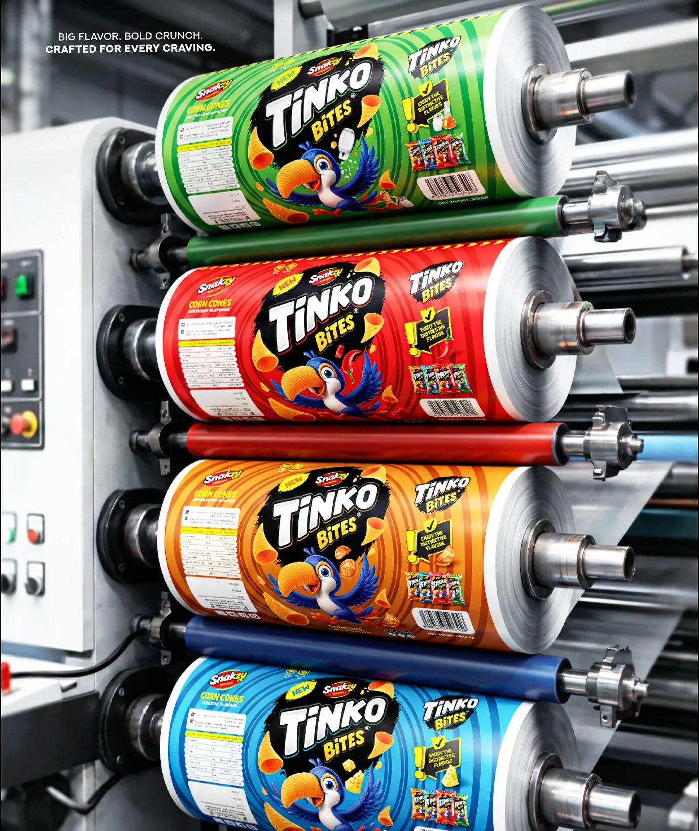
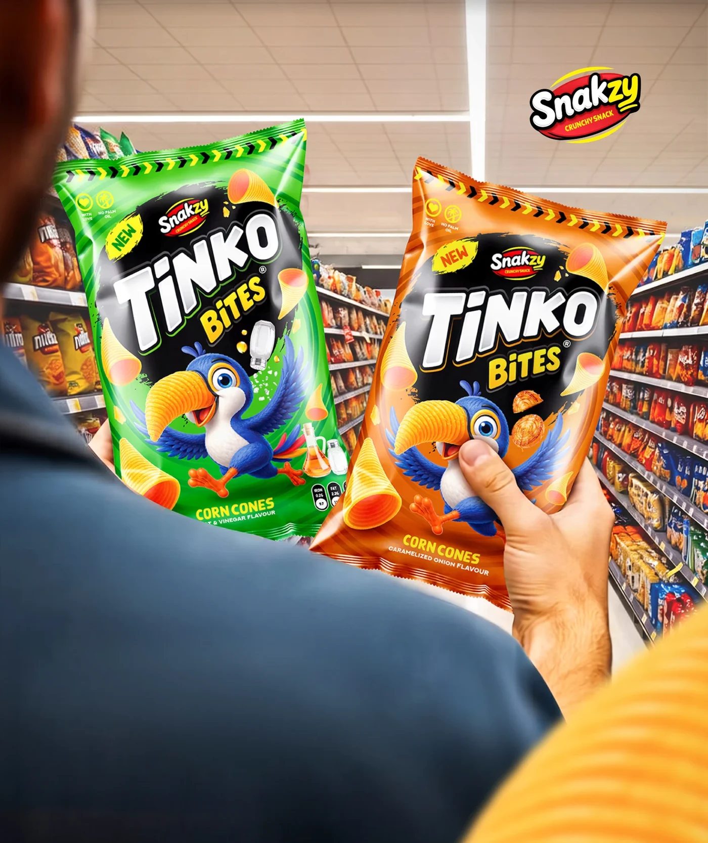
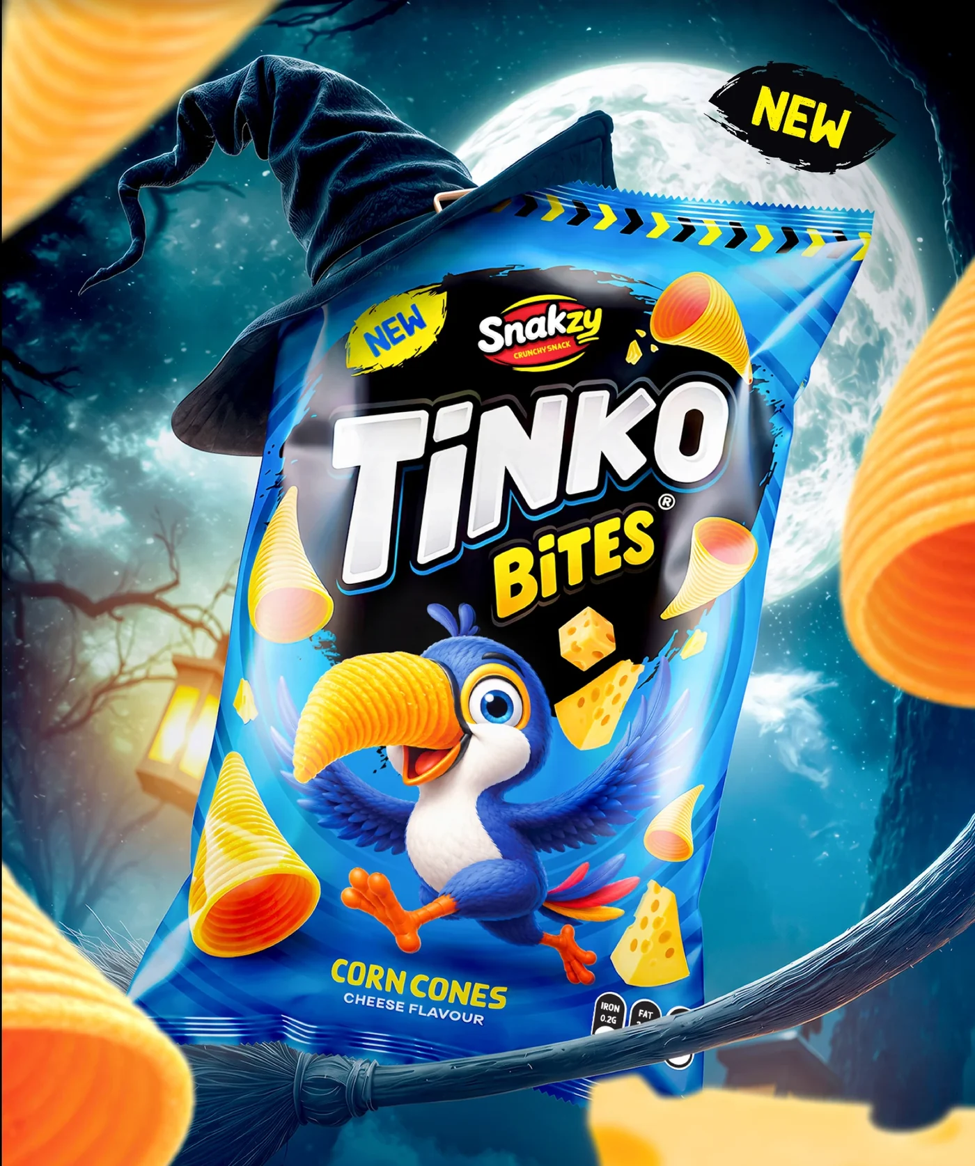
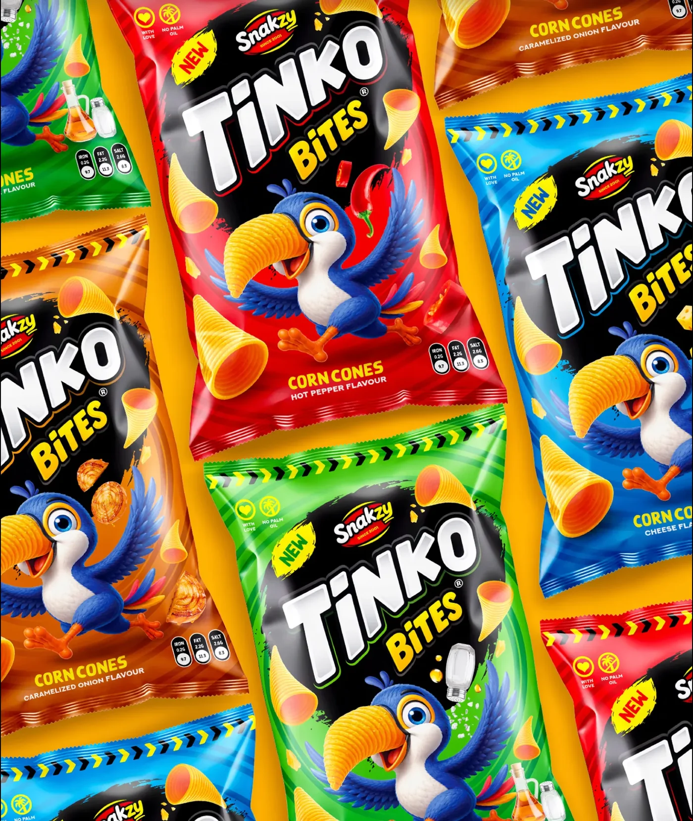
Packaging and launch visuals for Tinko Bites, a new corn cone snack from Snakzy. A toucan mascot whose beak is a corn cone, one pack system in four flavour colours, and visuals that follow the packs from the print press to the shelf to seasonal social posts.

Project overview

A crowded snack aisle needs a reason to look twice. The answer was a character built from the product itself, a bold black burst behind the logo on every pack, and one flavour colour per pack so the range reads in a second.

Typography

TinkoBites
Corn conesChunky display logo + condensed caps

A chunky, slanted display logo with a white bevel, a bright yellow “Bites” sub-logo, and rounded condensed capitals for flavour names, all sitting on a rough black brush burst.

Colour palette

  • Corn yellow#F0A402
  • Chilli red#D70201
  • Lime green#55C827
  • Sky blue#04AFF0
  • Toucan blue#2551AC

Corn yellow as the brand stage, one strong colour per flavour (chilli red, lime green, sky blue, onion orange), and the toucan’s blue tying them together.

Visual strategy

  1. A mascot built from the product
  2. One pack system, four flavour colours
  3. Repeat-pattern hero shots
  4. Shopper’s-eye retail scenes
  5. Seasonal social moments
  6. Behind-the-scenes print production

Every visual keeps the pack front and centre and lets the mascot carry the fun.

Storyboard

“Big Flavor. Bold Crunch.”

Spot
20-second launch video
Format
4:5 feed, 9:16 Reels and stories
Frames
6
Language
English
Version
Storyboard v1
  1. 01Hook0:00–0:03
    Track down
    Shot
    Top-down on the tiled packs, fast diagonal track down.
    Action
    Packs slide past in all four colours; each “New” badge pops as it crosses the centre.
    Super
    New Tinko Bites
    Audio
    A crunch on each pack that passes, then a beat drop.
    Snap zoom into the red pack
  2. 02Made bold0:03–0:06
    Track right
    Shot
    Macro on the printing press, tracking along the rolls.
    Action
    The printed film races over the rollers, flavour after flavour.
    Super
    Big flavor. Bold crunch.
    Audio
    Machine rhythm that turns into the music beat.
    Film wipes across the lens
  3. 03The aisle0:06–0:10
    Push in
    Shot
    Over-the-shoulder in the snack aisle, slow push in.
    Action
    A shopper holds one pack in each hand, looking from one to the other. The toucans seem to look back.
    Super
    Crafted for every craving.
    Audio
    Store ambience fades under the music.
    Pack flip
  4. 04The flavours0:10–0:13
    Locked off
    Shot
    Locked off, close on the packs.
    Action
    The four flavours cut in on the beat, each with its ingredient flying past: chilli, onion, salt, cheese.
    Super
    Hot pepper · Caramelized onion · Salt & vinegar · Cheese
    Audio
    Four quick crunches, one per flavour.
    Cut to night
  5. 05Seasonal cut-in0:13–0:16
    Orbit
    Shot
    Low angle under a full moon, orbiting the pack.
    Action
    The cheese pack swoops by on a broomstick in a witch’s hat. Corn cones tumble toward the lens.
    Super
    New
    Audio
    Wind, a cackle, a spooky sting on the beat.
    Cone passes the lens: wipe
  6. 06End card0:16–0:20
    Pull out
    Shot
    Pull out to the full pattern of packs.
    Action
    The packs settle into the tiled pattern and the Snakzy logo lands in the centre.
    Super
    Big flavor. Bold crunch. Crafted for every craving. + Snakzy logo
    Audio
    Music resolves on one final crunch.
    End
Project 06

Kiva: skin care rooted in nature

  • Social ad series
  • Skin care
  • Product photography
  • Social ads
  • Feed grid

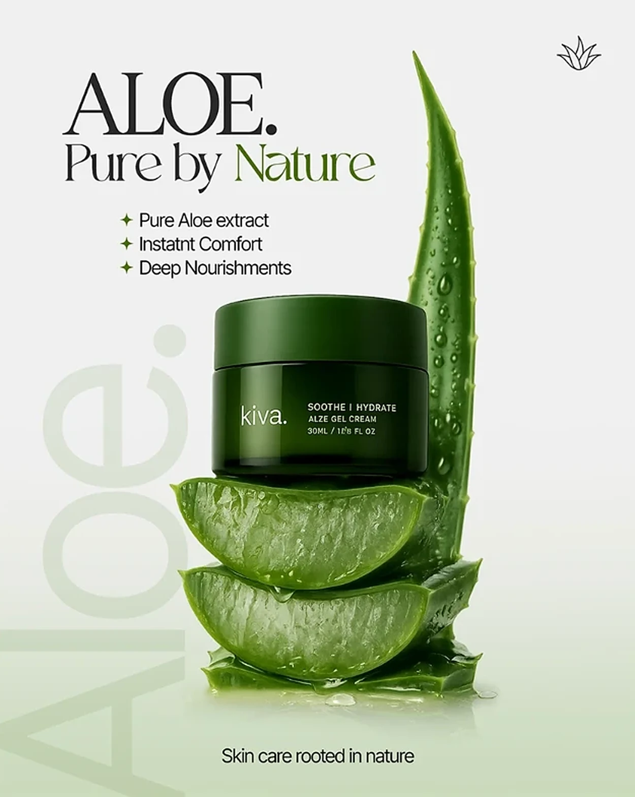
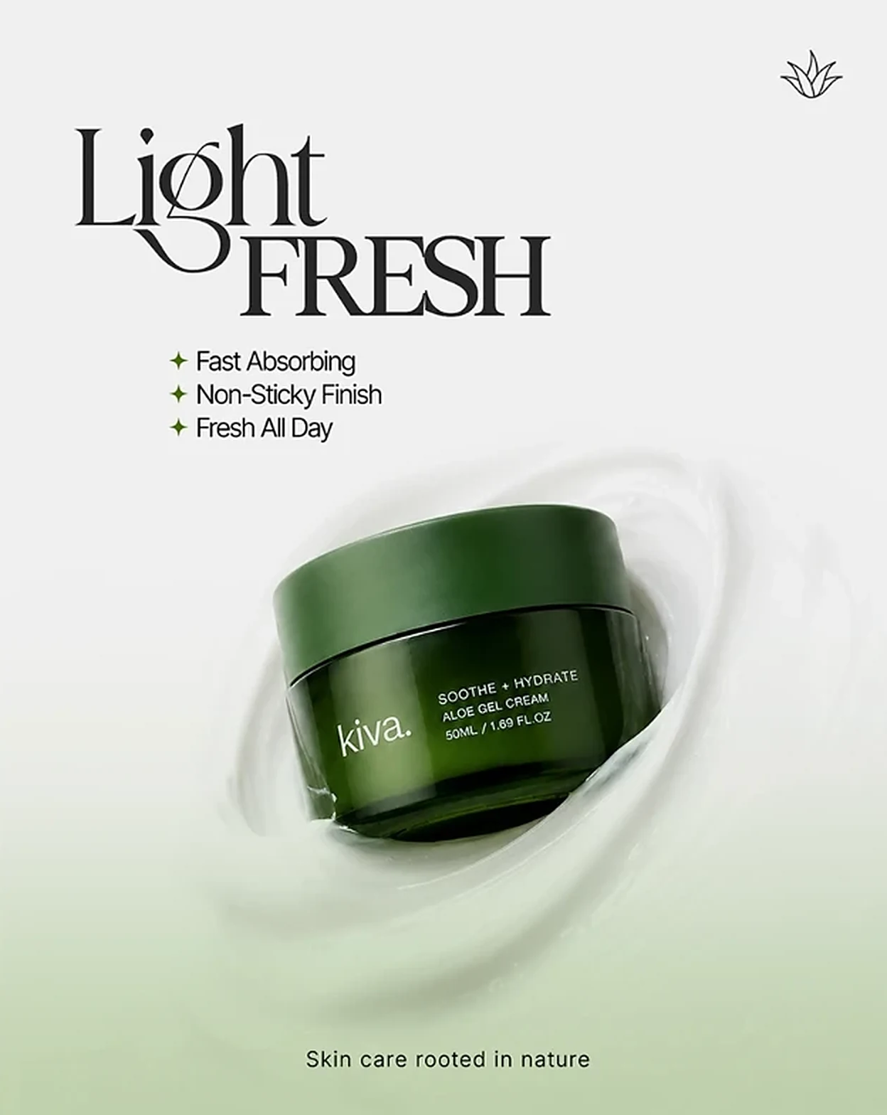
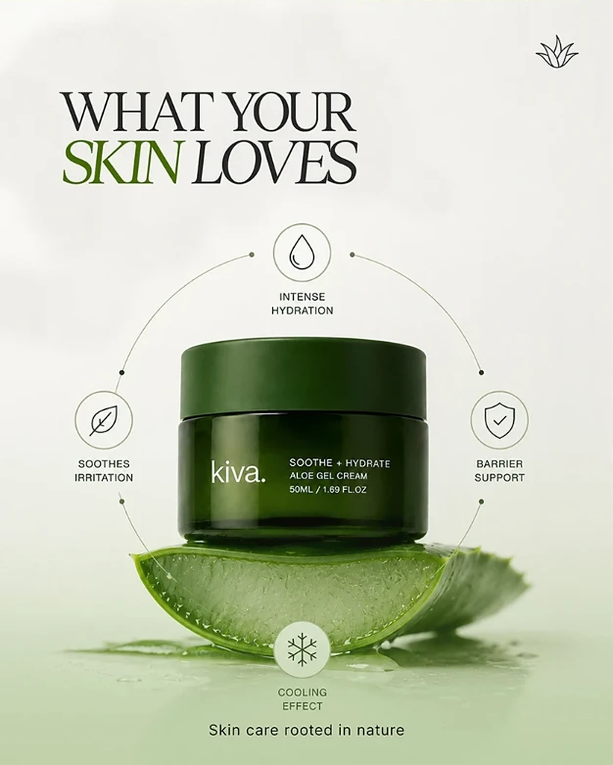
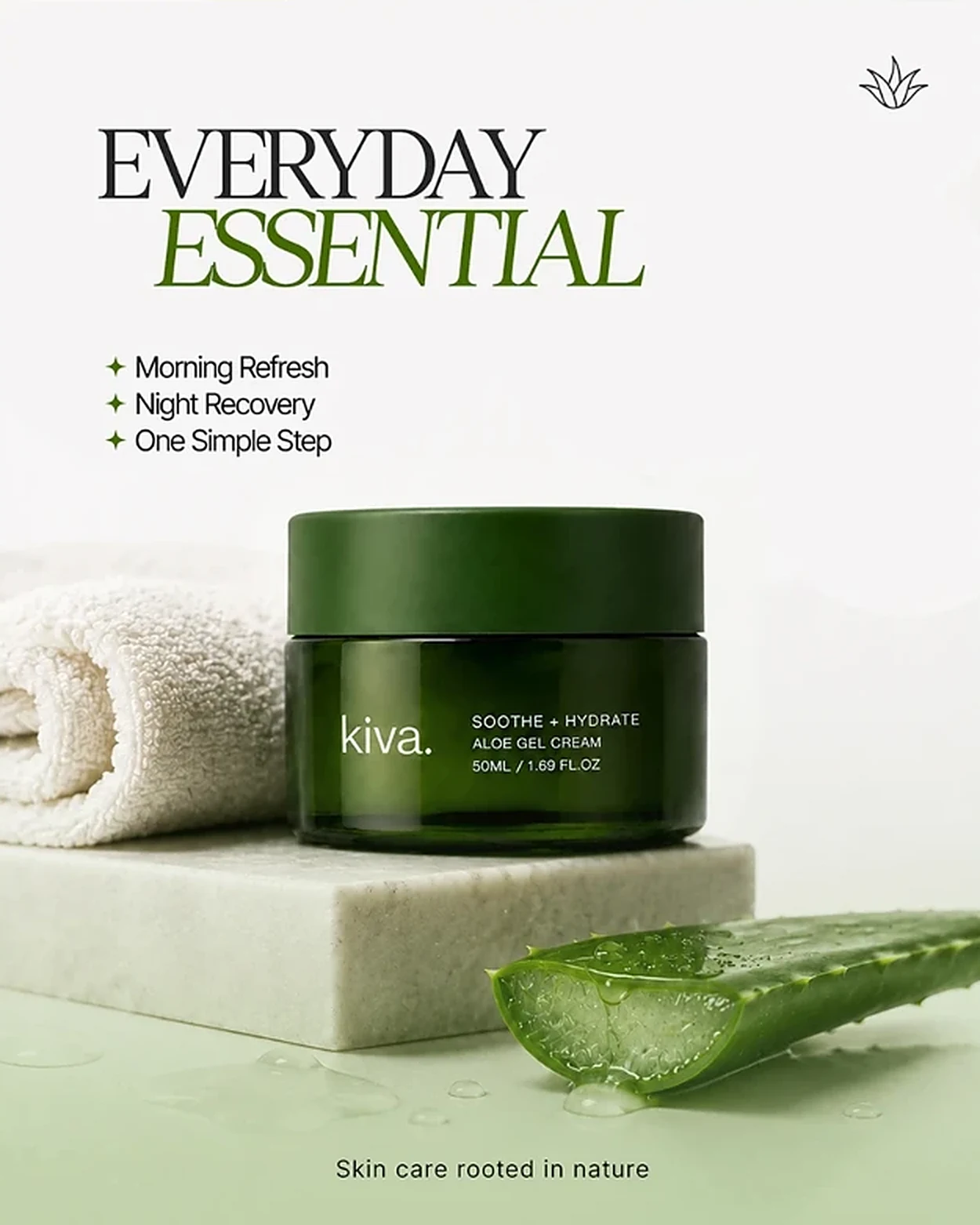
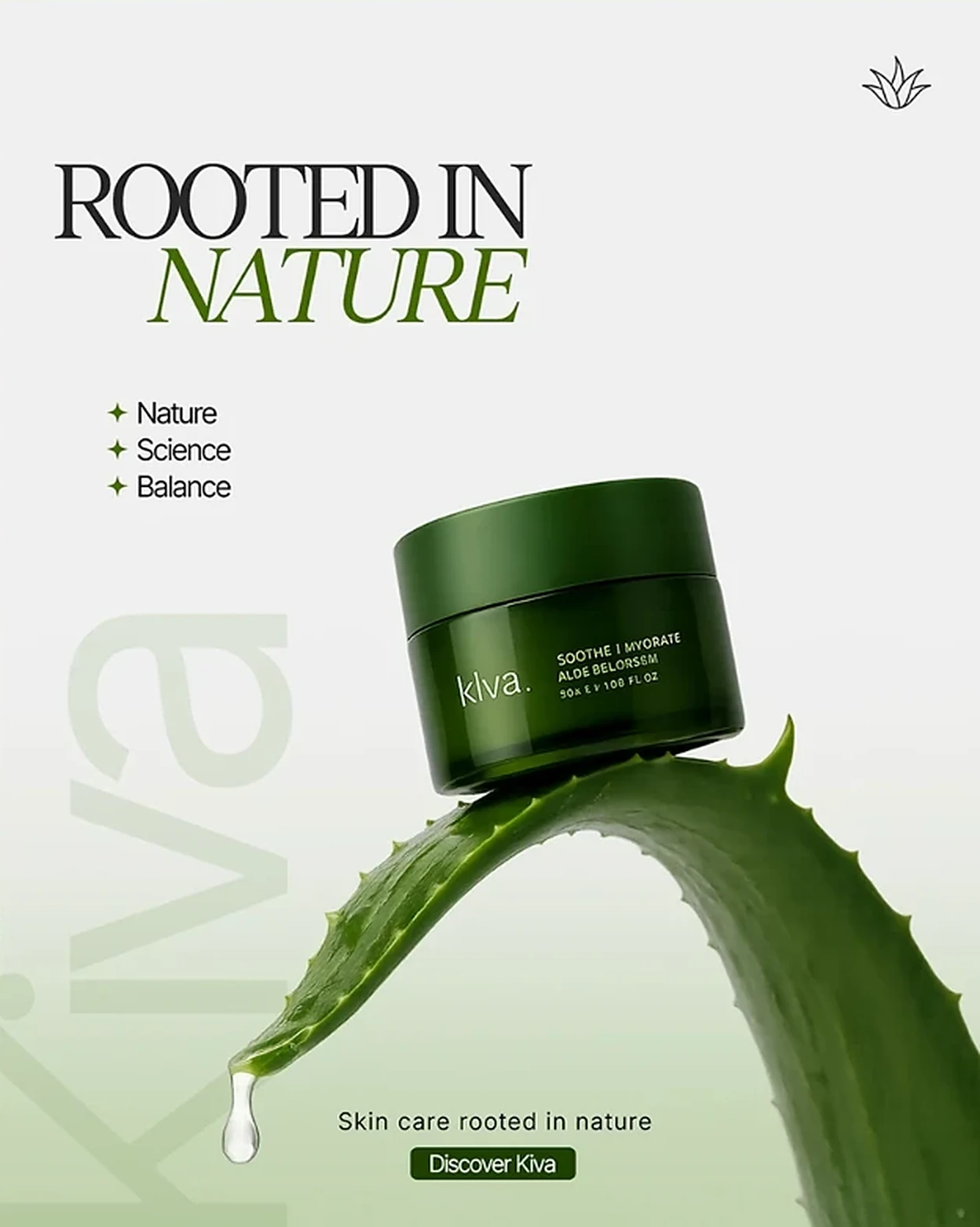
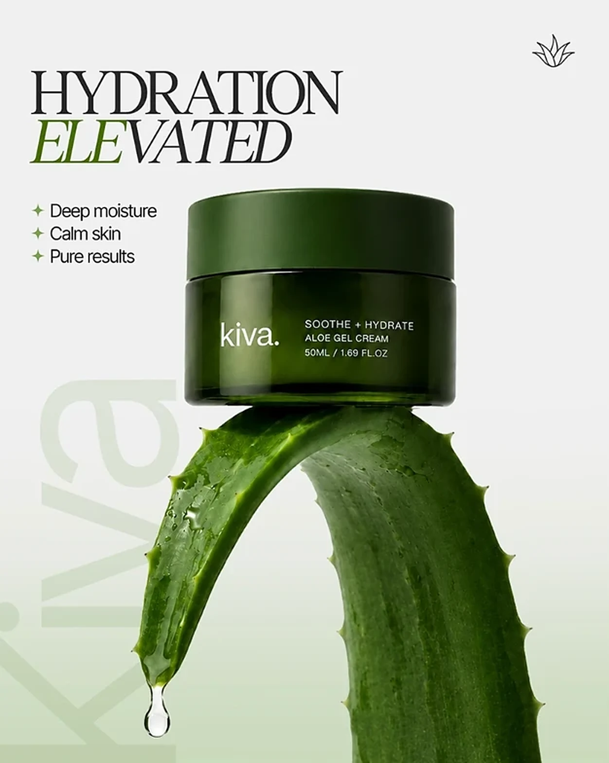
A six-post social series for Kiva’s Soothe + Hydrate aloe gel cream. Real aloe leaves as the set, one product hero per post and one shared layout, so the posts read as a single, calm brand on the feed grid.

Project overview

Calm sells skin care. Every post uses the same quiet recipe: soft mist background, real aloe, one green jar, a two-line headline, three short benefits and the line “Skin care rooted in nature”.

Typography

Aloe.Hydration
elevatedHigh-contrast serif + green italic accent

Condensed, high-contrast serif headlines in capitals, with one word in green italic for emphasis, plus a clean sans-serif for the short benefit lists.

Colour palette

  • Jar green#324D20
  • Aloe green#45670B
  • Sage#CBDABB
  • Mist#F0F0F0
  • Ink#252525

Deep jar green and fresh aloe green for the product and its source, soft mist and sage for a clean, spa-like ground, and near-black ink for the headlines.

Visual strategy

  1. Real aloe as set and story
  2. One product hero per post
  3. A shared post template
  4. Benefit lists and icon wheels
  5. Bathroom ritual styling
  6. Soft call to action on the last post

A strict template, so each post feels new but the grid looks like one brand.

Storyboard

“Rooted in Nature”

Spot
20-second social video
Format
4:5 feed, 9:16 Reels and stories
Frames
6
Language
English
Version
Storyboard v1
  1. 01Hook0:00–0:03
    Tilt up
    Shot
    Macro on the leaf tip, slow tilt up to the jar.
    Action
    A single drop of aloe gel falls from the leaf tip; the camera rises along the leaf to the jar balanced on top.
    Super
    Hydration Elevated
    Audio
    One water drop, soft ambient pad.
    Drop splash: match cut
  2. 02The source0:03–0:06
    Push in
    Shot
    Medium close-up, slow push in.
    Action
    Two fresh aloe slices settle into a stack and the jar lands on top, droplets running down the leaf behind.
    Super
    Aloe. Pure by Nature
    Audio
    A soft gel squish as the jar lands.
    Swirl wipe
  3. 03The texture0:06–0:10
    Orbit
    Shot
    Top-down, orbiting the jar.
    Action
    The jar spins inside a ribbon of white cream that swirls around it and settles.
    Super
    Light Fresh · Fast absorbing · Non-sticky finish
    Audio
    Silky whoosh with the swirl.
    Cream fills frame
  4. 04The benefits0:10–0:13
    Locked off
    Shot
    Locked off, front on.
    Action
    Four benefit icons draw themselves in a circle around the jar, one per beat.
    Super
    What Your Skin Loves · Hydration · Soothing · Barrier · Cooling
    Audio
    Four light chimes.
    Soft dissolve
  5. 05The ritual0:13–0:16
    Dolly in
    Shot
    Bathroom counter, slow dolly in past the towel.
    Action
    Morning light moves across the marble block, the towel and the jar.
    Super
    Everyday Essential · Morning refresh · Night recovery
    Audio
    Room tone, a towel brush, the music lifts.
    Light flare
  6. 06End card0:16–0:20
    Pull out
    Shot
    Pull out to the full frame.
    Action
    The jar rests on an aloe leaf as one last drop falls. The Kiva logo and the Discover Kiva button appear.
    Super
    Rooted in Nature · Skin care rooted in nature · Discover Kiva
    Audio
    Music resolves on the final drop.
    End
Project 07

Uber: day or night, Uber’s got you

  • Social ad campaigns
  • Ride-hailing & delivery
  • Seasonal promos
  • Social ads
  • Bangladesh

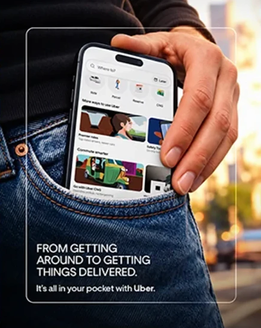
Twelve social posts across Uber’s services in Bangladesh: rides, CNG, Intercity, Parcel and XL, plus seasonal moments like Eid, Puja and the World Cup. Each post sells one service with one clear line, set in a recognisable Dhaka scene.

Client work for Uber in Bangladesh.

Project overview

A ride app has many jobs to sell. The series gives each service its own post and its own everyday moment (traffic, a trip home for Eid, a parcel for a small shop, a World Cup night out), all held together by the same clean Uber typography and real Dhaka settings.

Typography

UberDay or night,
Uber’s got you.Geometric brand sans, sentence case

A clean, geometric brand sans-serif in sentence case for headlines, bold weights for offers and promo codes, and Bangla headlines set to sit comfortably beside the English.

Colour palette

  • Uber black#000000
  • White#FFFFFF
  • Sky blue#9CCAF1
  • CNG green#147F41
  • Sunset gold#FCCB68

Uber black and white as the brand base, with colour taken from each scene: sky blue days, CNG green, highway-sign green and warm sunset gold.

Visual strategy

  1. One service per post
  2. Local Dhaka scenes and landmarks
  3. Seasonal hooks: Eid, Puja, World Cup
  4. Clear offer badges and promo codes
  5. Bangla and English copy
  6. App screens as proof of ease

One service, one moment, one line, so each post is understood in a single scroll.

Storyboard

“Day or Night, Uber’s Got You”

Spot
20-second brand video
Format
4:5 feed, 9:16 Reels and stories
Frames
6
Language
English and Bangla
Version
Storyboard v1
  1. 01Hook0:00–0:03
    Track right
    Shot
    Low angle on a busy Dhaka road, tracking alongside.
    Action
    Traffic stands still; a green Uber CNG slips past the queue and out of frame.
    Super
    City traffic? Ride on.
    Audio
    Horns and engines, then a clean whoosh as the CNG passes.
    Whip pan into a pocket
  2. 02The app0:03–0:06
    Push in
    Shot
    Close-up on a jeans pocket, push in to the screen.
    Action
    A hand pulls the phone out and the Uber app opens on rides, parcels and more.
    Super
    It’s all in your pocket with Uber.
    Audio
    A soft tap, the music starts.
    Screen tap: cut
  3. 03Together0:06–0:10
    Handheld
    Shot
    Handheld inside an Uber XL at night.
    Action
    Six friends in rival World Cup jerseys argue, laugh and fit into one ride.
    Super
    No one gets left behind on World Cup nights.
    Audio
    Crowd chant on the radio, friends laughing.
    Door slide wipe
  4. 04Delivery0:10–0:13
    Crane up
    Shot
    Low angle, crane up from the phone screen to the courier.
    Action
    A courier with an Uber Parcel box rises out of the app as the city speeds past.
    Super
    Anything, anywhere with Uber Parcel.
    Audio
    Notification ping, motorbike pass-by.
    Light streak transition
  5. 05The moment0:13–0:16
    Dolly in
    Shot
    Golden hour outside Dhaka airport, slow dolly in.
    Action
    Two friends run toward each other and hug beside a black Uber car.
    Super
    When goodbye is close, distance shouldn’t matter.
    Audio
    A plane overhead, the music swells.
    Day to night dissolve
  6. 06End card0:16–0:20
    Locked off
    Shot
    Locked off on a hotel entrance as day turns to night.
    Action
    A woman steps into a black Uber car. The Uber logo lands with the line.
    Super
    Day or night, Uber’s got you · Your next ride is just a tap away
    Audio
    Music resolves. VO: “Day or night, Uber’s got you.”
    End
Project 08

Steady: built for the nervous system

  • Brand + launch visuals
  • Wellness tech
  • Brand identity
  • Web & app
  • Launch visuals

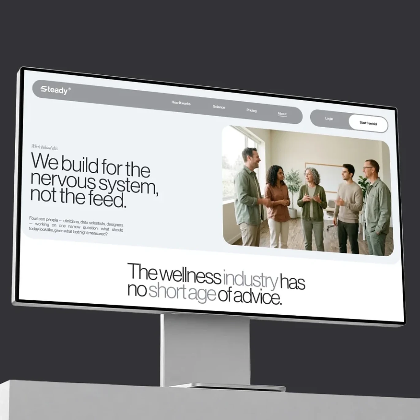
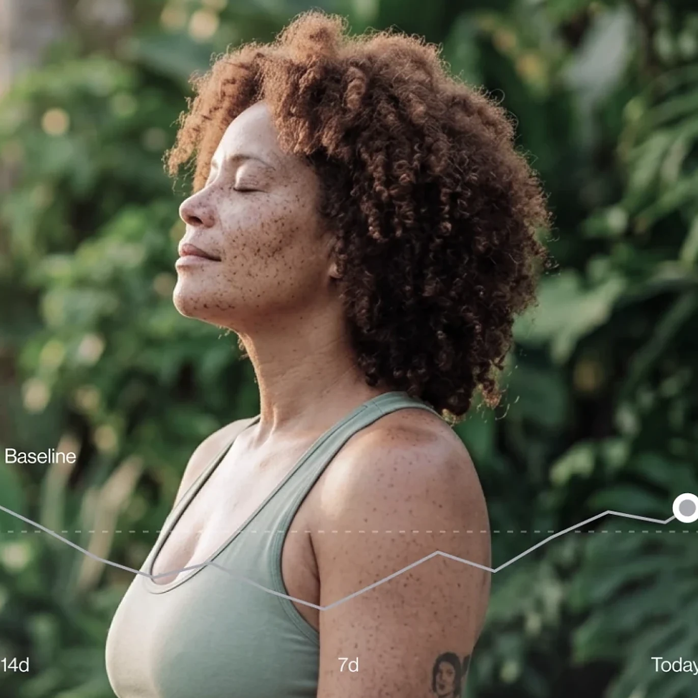
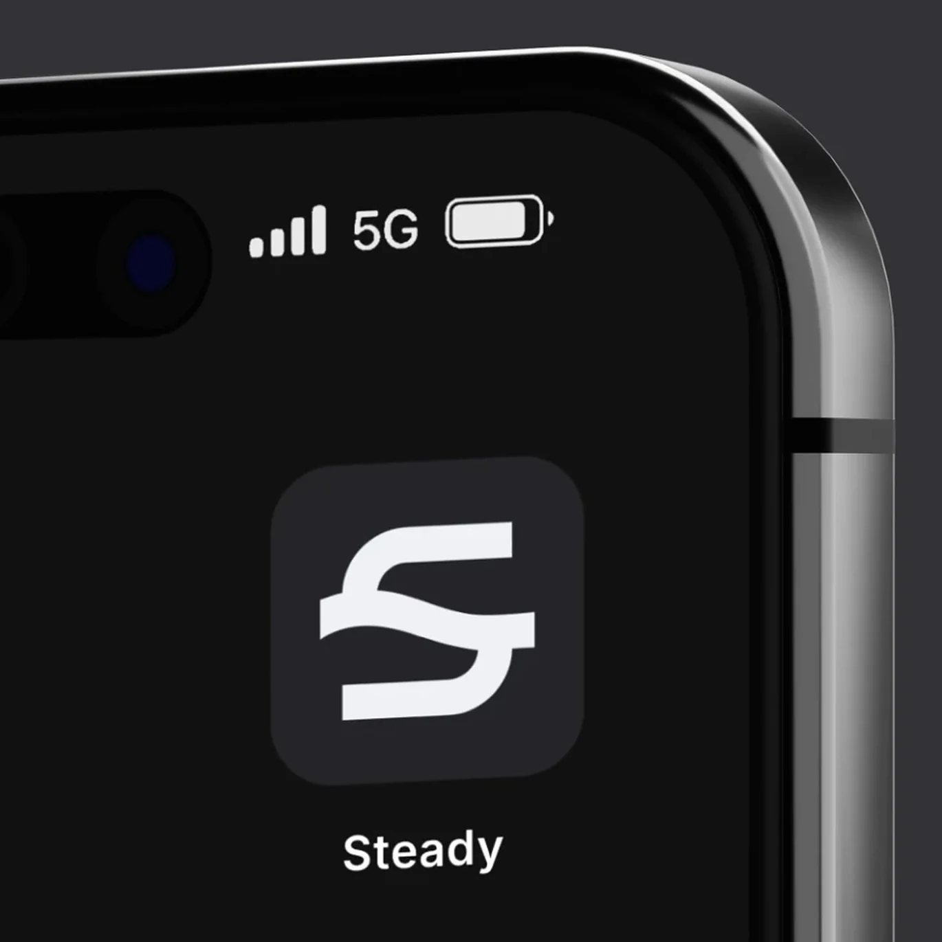
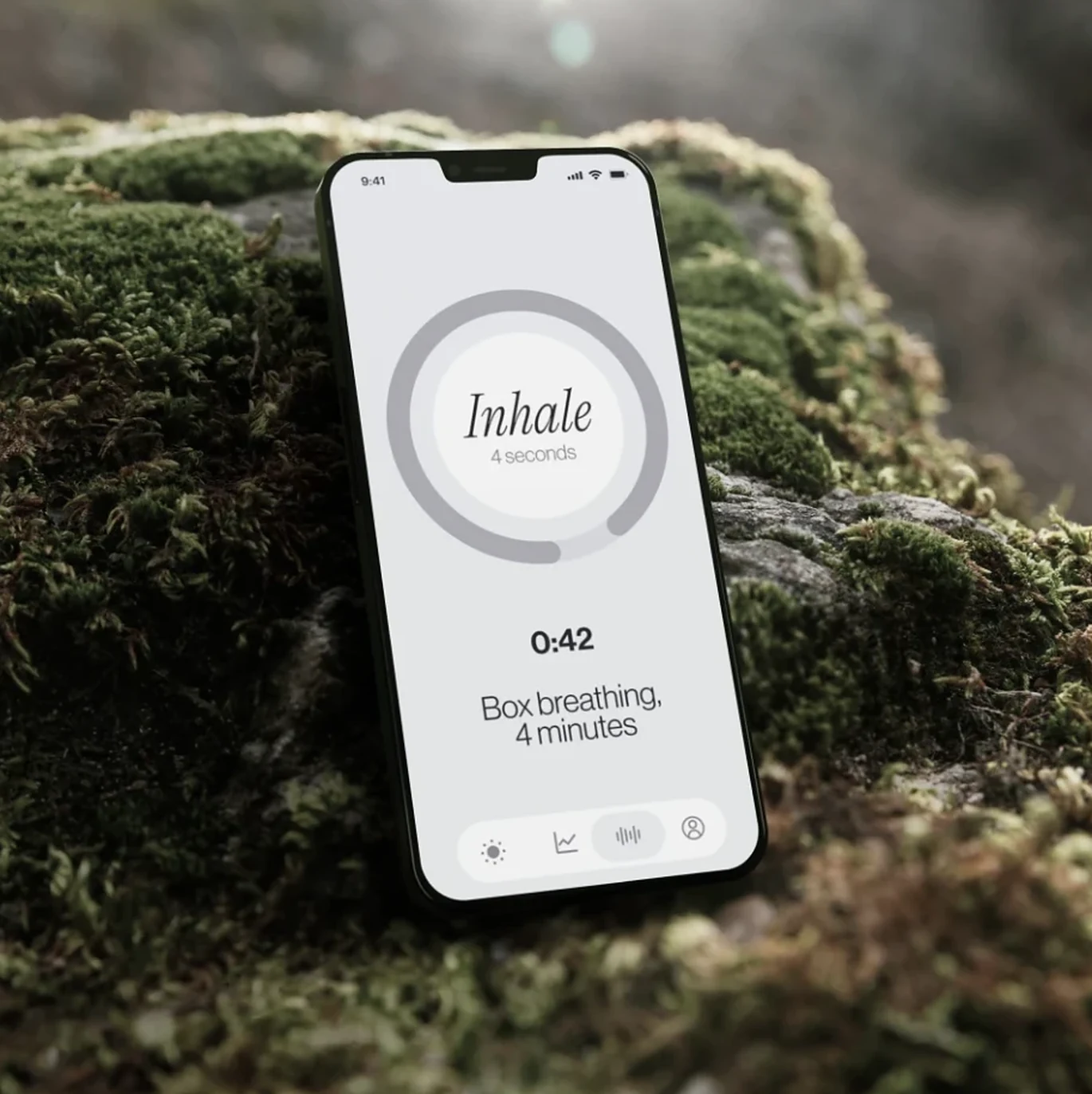
Launch visuals for Steady, a breathing and nervous-system wellness app: the website, the breathing screen, the app icon and a lifestyle image carrying the app’s trend line, all in one calm grey-and-green system.

Project overview

Wellness apps usually shout. Steady whispers: grey screens, a single serif word on the breathing ring, natural textures like moss and leaves, and data drawn as one quiet line instead of a dashboard.

Typography

InhaleWe build for the
nervous system.Tight grotesk + serif italic

A tightly tracked grotesk for headlines, with key words dropped to light grey for rhythm, and an elegant serif italic for the one word that matters on screen: Inhale.

Colour palette

  • Graphite#333237
  • Mist#EFF3F8
  • Moss#4E5934
  • Sage#95A29D
  • White#FFFFFF

Graphite and mist grey for the product world, moss and sage green from nature, and white for space to breathe.

Visual strategy

  1. Product placed in nature
  2. The website as a statement of belief
  3. Data as one calm line
  4. Real people, eyes closed
  5. A simple, memorable app icon
  6. Grey-and-green restraint

Every visual slows the viewer down, which is exactly what the product promises.

Storyboard

“Breathe”

Spot
20-second launch video
Format
1:1 and 4:5 feed, 9:16 stories
Frames
6
Language
English
Version
Storyboard v1
  1. 01Hook0:00–0:03
    Locked off
    Shot
    Locked off on a busy screen of notifications that fades to calm grey.
    Action
    Pings pile up, then everything clears to one line of text.
    Super
    The wellness industry has no shortage of advice.
    Audio
    A flurry of notification sounds, then sudden silence.
    Hard cut to the monitor
  2. 02The belief0:03–0:06
    Push in
    Shot
    Slow push in on the website on a monitor.
    Action
    The headline types on: we build for the nervous system, not the feed.
    Super
    We build for the nervous system, not the feed.
    Audio
    Soft room tone, a single low note.
    Dissolve to nature
  3. 03The product0:06–0:10
    Push in
    Shot
    Macro on the phone resting on moss, push in to the ring.
    Action
    The breathing ring slowly fills as the timer counts: Inhale, 4 seconds.
    Super
    Inhale · Box breathing, 4 minutes
    Audio
    Birdsong and one slow, audible breath in.
    Match on the ring’s circle
  4. 04The person0:10–0:14
    Dolly in
    Shot
    Close-up portrait in greenery, slow dolly in.
    Action
    A woman breathes out, eyes closed, shoulders dropping.
    Super
    No text on screen: let the breath land.
    Audio
    The breath out, leaves moving.
    Line draws across frame
  5. 05The proof0:14–0:17
    Track right
    Shot
    Same portrait, tracking along the trend line.
    Action
    A thin line draws from the 14-day baseline to today and lands on a white dot.
    Super
    Baseline · 14d · 7d · Today
    Audio
    A soft rising tone that resolves on the dot.
    Fade to graphite
  6. 06End card0:17–0:20
    Locked off
    Shot
    Locked off on the phone corner.
    Action
    The flowing S icon appears with the name Steady beneath it.
    Super
    Steady
    Audio
    Silence, then one gentle chime.
    End
Project 09

PayTech: a smarter way to trade

  • Brand identity + launch visuals
  • Fintech & crypto
  • Visual identity
  • App UI
  • Social stories

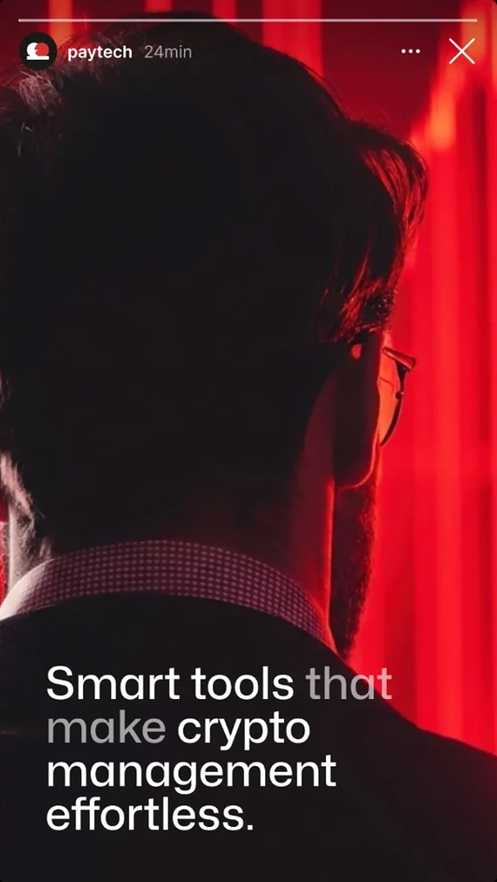
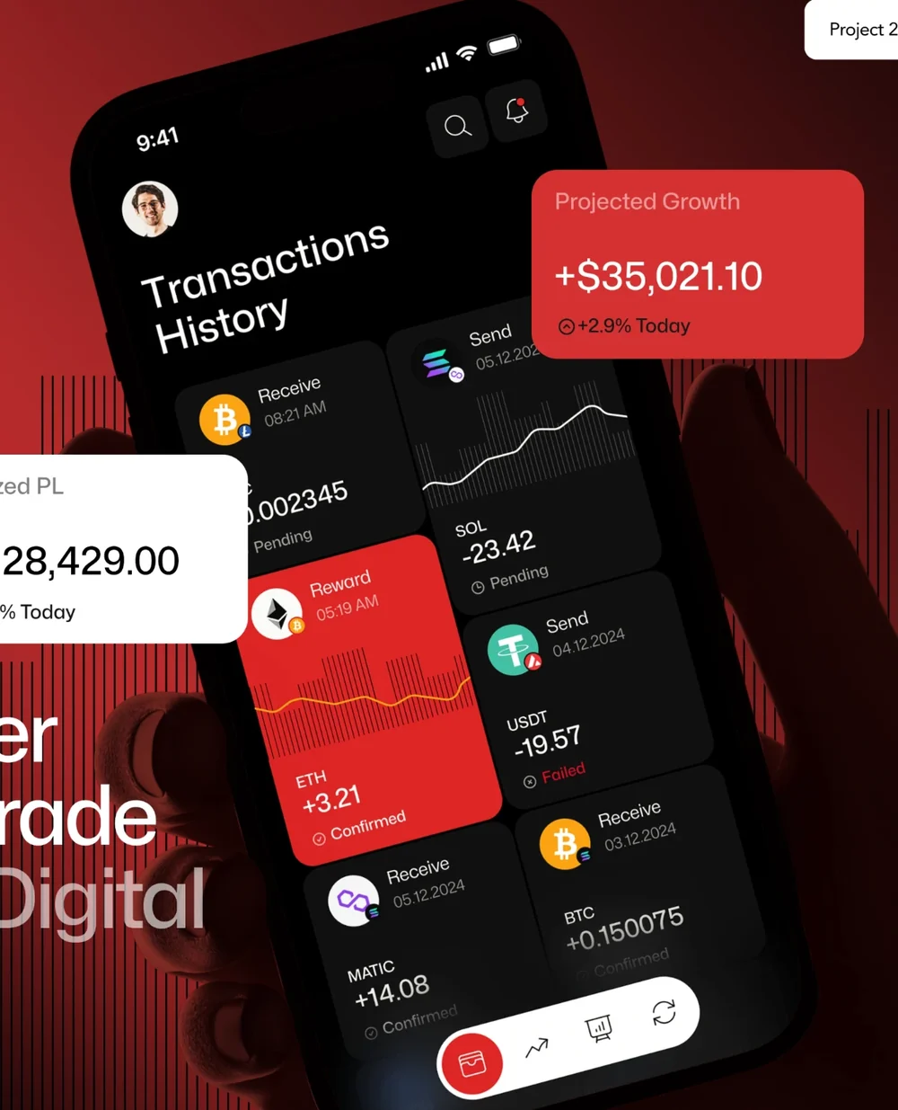
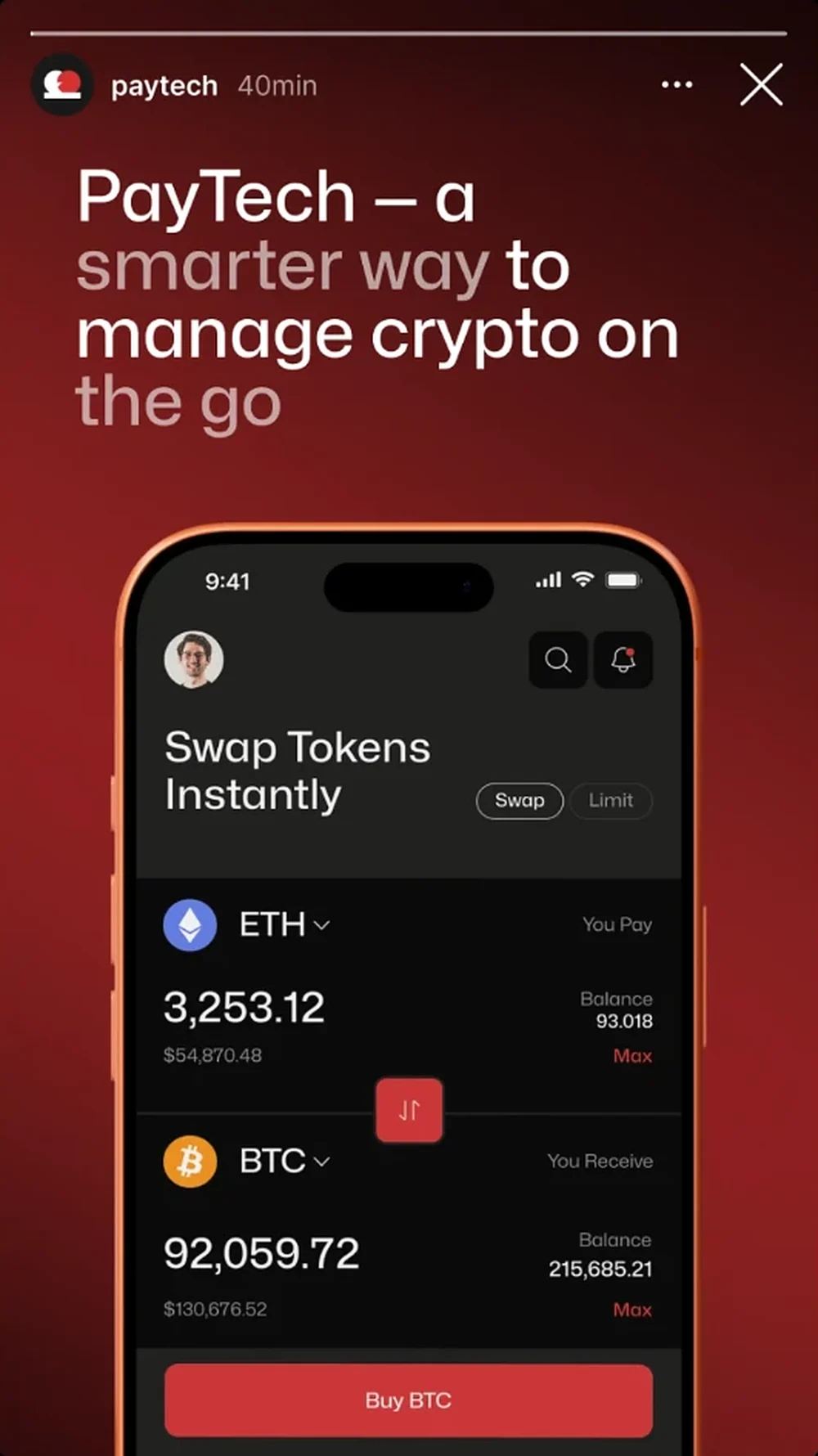
PayTech is a crypto trading and wallet platform that makes complex financial operations simple while keeping security and control high: one clear, scalable system for trading, swapping and managing digital assets in a single interface. This project covers its visual identity, key app visuals and launch stories.

Project overview

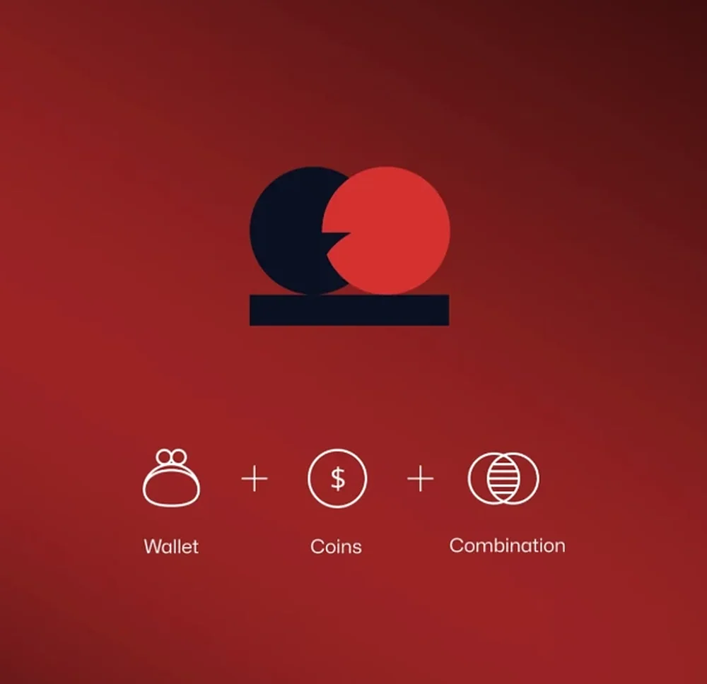
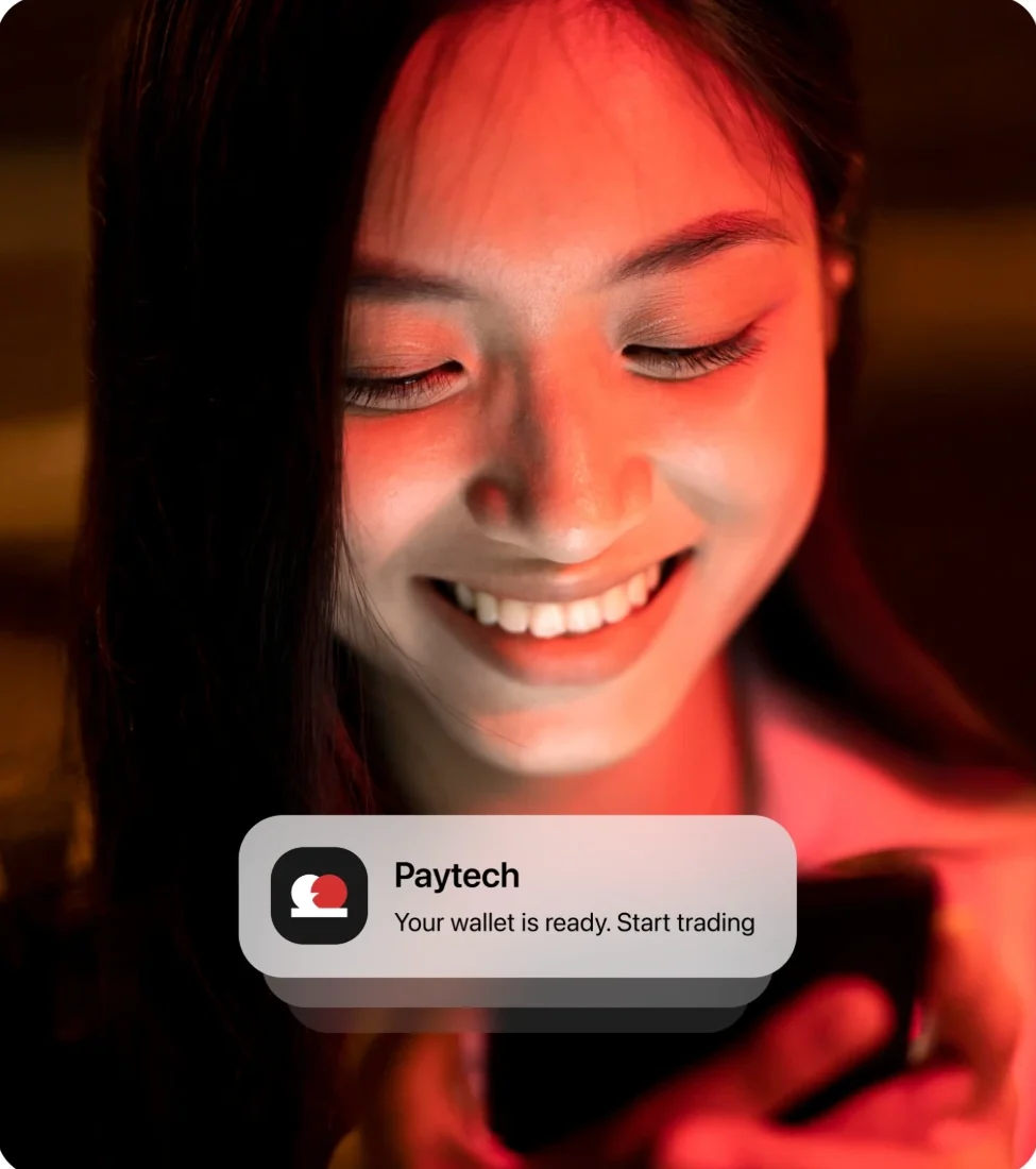
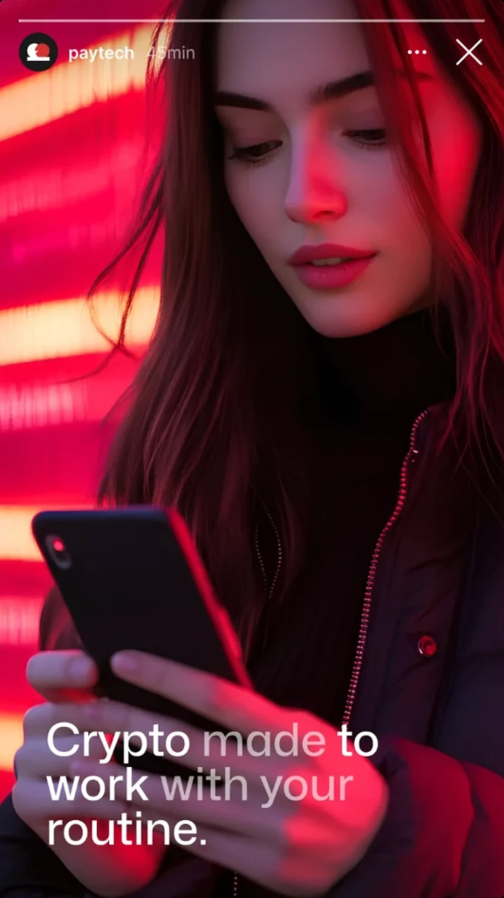
Crypto feels risky and complicated, so the brand had to feel calm, sharp and in control. A deep red and black system, a logo that literally combines a wallet and coins, real people in warm screen light, and headlines that put the important words in white and the rest in grey.

Typography

AaA smarter
way to tradeGeometric sans, two-tone emphasis

A clean geometric sans-serif with two-tone headlines: the key words in white, the supporting words in soft grey, so every line can be read in a glance.

Colour palette

  • Signal red#D53131
  • Brand red#B02929
  • Maroon#320C0C
  • Logo navy#0A1022
  • White#FFFFFF

Signal red for action and the brand mark, deep maroon and black for a serious, secure feel, a dark navy from the logo, and white for the numbers that matter.

Visual strategy

  1. A logo built from wallet + coins
  2. App screens as the hero
  3. Floating data cards for proof
  4. Two-tone headlines
  5. Warm red screen-light portraits
  6. Story-first social formats

Every piece pairs real people with real product screens, so trust and clarity land together.

Storyboard

“A Smarter Way to Trade”

Spot
20-second launch video
Format
9:16 stories and Reels, 4:5 feed
Frames
6
Language
English
Version
Storyboard v1
  1. 01Hook0:00–0:03
    Push in
    Shot
    Over-the-shoulder in red light, slow push in.
    Action
    A man stares at a wall of red market light, glasses catching the glow.
    Super
    Smart tools that make crypto management effortless.
    Audio
    Low synth pulse, a ticking market sound.
    Cut to black
  2. 02The brand0:03–0:06
    Locked off
    Shot
    Locked off on red, front on.
    Action
    A wallet icon and a coin icon slide together and merge into the PayTech mark.
    Super
    Wallet + Coins = PayTech
    Audio
    Two soft clicks, then a deeper lock-in sound.
    Mark scales into a phone screen
  3. 03The product0:06–0:10
    Push in
    Shot
    Screen recording inside a phone, push in.
    Action
    ETH swaps to BTC in one tap; the numbers roll and the Buy button pulses.
    Super
    Swap tokens instantly
    Audio
    UI taps, a rising swoosh on the swap.
    Phone tilts into the hand
  4. 04The proof0:10–0:13
    Orbit
    Shot
    Hand-held phone, slow orbit.
    Action
    The transactions history scrolls as two cards float out: Realized PL and Projected Growth.
    Super
    A smarter way to trade & swap digital assets
    Audio
    Card pops, one per number.
    Notification drop
  5. 05The moment0:13–0:16
    Dolly in
    Shot
    Close-up, face lit by the phone, slow dolly in.
    Action
    A notification slides in and she smiles at it.
    Super
    Your wallet is ready. Start trading
    Audio
    A soft notification chime, the music opens up.
    Light flare
  6. 06End card0:16–0:20
    Locked off
    Shot
    Medium close-up in neon light, locked off.
    Action
    She checks her phone on the move. The PayTech logo lands with the line.
    Super
    Crypto made to work with your routine. + PayTech logo
    Audio
    Music resolves on a final pulse.
    End
Next

Want ads like this for your brand?

Tell me what you sell and where you advertise. I’ll come back with ideas, key visuals and a storyboard your team can shoot or animate.

Private work

Full portfolio

Case studies and client results are password protected. Enter the password to view them.

Don’t have the password? Request access

What do you need?
Monthly budget
No spam. By sending, you agree to the privacy policy.